
DESIGN SYSTEM 2023
Time to buy in on design systems
A design system is a set of reusable components – gathered around guidelines and standards – that functions as a single source of truth. It is created for the purpose of reducing redundancy and ensuring visual consistency across all platforms.
In essence, it’s a working file containing all the visual components that are used when building screens. Ideally, these components are documented and have set rules.


“A design system acts as the connective tissue that holds together your entire platform.”
– Drew Bridewell, Invision
The difference between a design system and a style guide?
Nowadays, with so much design lingo flying about it’s confusing. Even for designers, the terms design system and style guide are often used interchangeably. But it is important to clearly define the difference between the two:
- A style guide – also called a pattern library – is a document that concentrates on setting the standard in terms of graphic style, color, typography, iconography, imagery and principles of a brand, and also offers direction on how to use it. Style guides answer the question of “How” something should look and “Where” it should be implemented.
- A design system is much more than the above; rather it is a set of rules, principles, a scheme or a process that consists of visual style guides, pattern libraries, brand guidelines and values. It is also documentation that forms the base of a shared design language. Overall, a design system helps in the building of a standard, efficient and consistent experience.
Simply put, the style guide is more oriented toward the brand and the design system toward the product.
Why is it important to build a design system?
A design system is a single source of truth and, as such, provides many benefits:
- It allows product development at scale and for this to be done efficiently.
- It improves collaboration and creates a unified language within and across teams.
- It ensures a visual consistency across all products, platforms and channels.
- It acts as an educational reference tool for new designers and other stakeholders.
- It introduces consistency, which leads to a better user experience and happier customers.
How does it look like?
We made the design system very accessible for this website. In the world of design, the cobbler’s son often goes barefoot and it’s sometimes a challenge to find time to just take care of one’s own assets (website, social media, design system, etc.). However, we wanted to go that extra mile, therefore, we organized our library so that customers can use it for demonstration and education purposes. Fortunately, by doing this, we also enhanced our own efficiency at the same time.
Feel free to duplicate and install our design system for inspiration. We will keep it updated!
Figma based design library
Colors definiton, typography, icons and more
What’s inside?
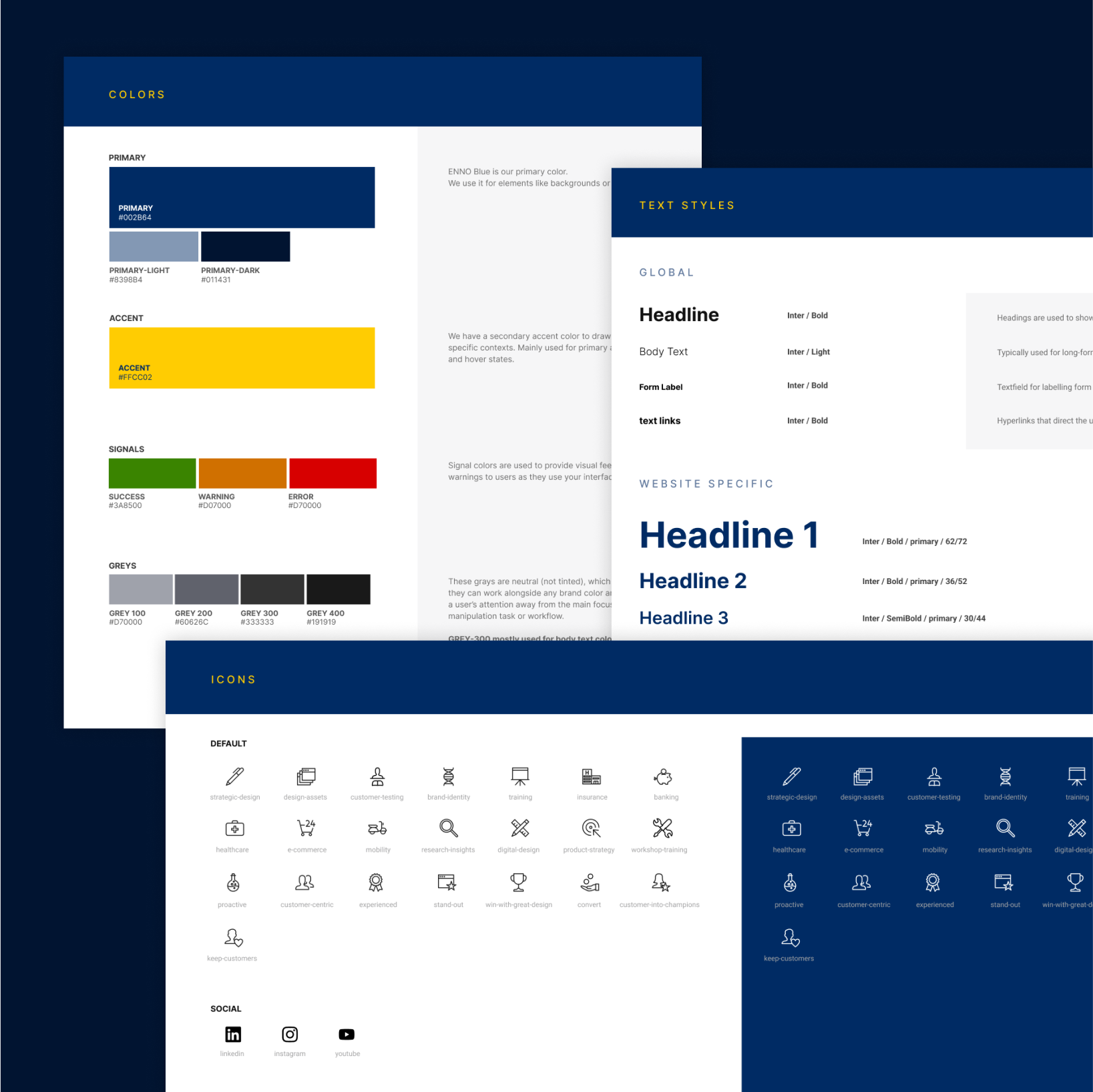
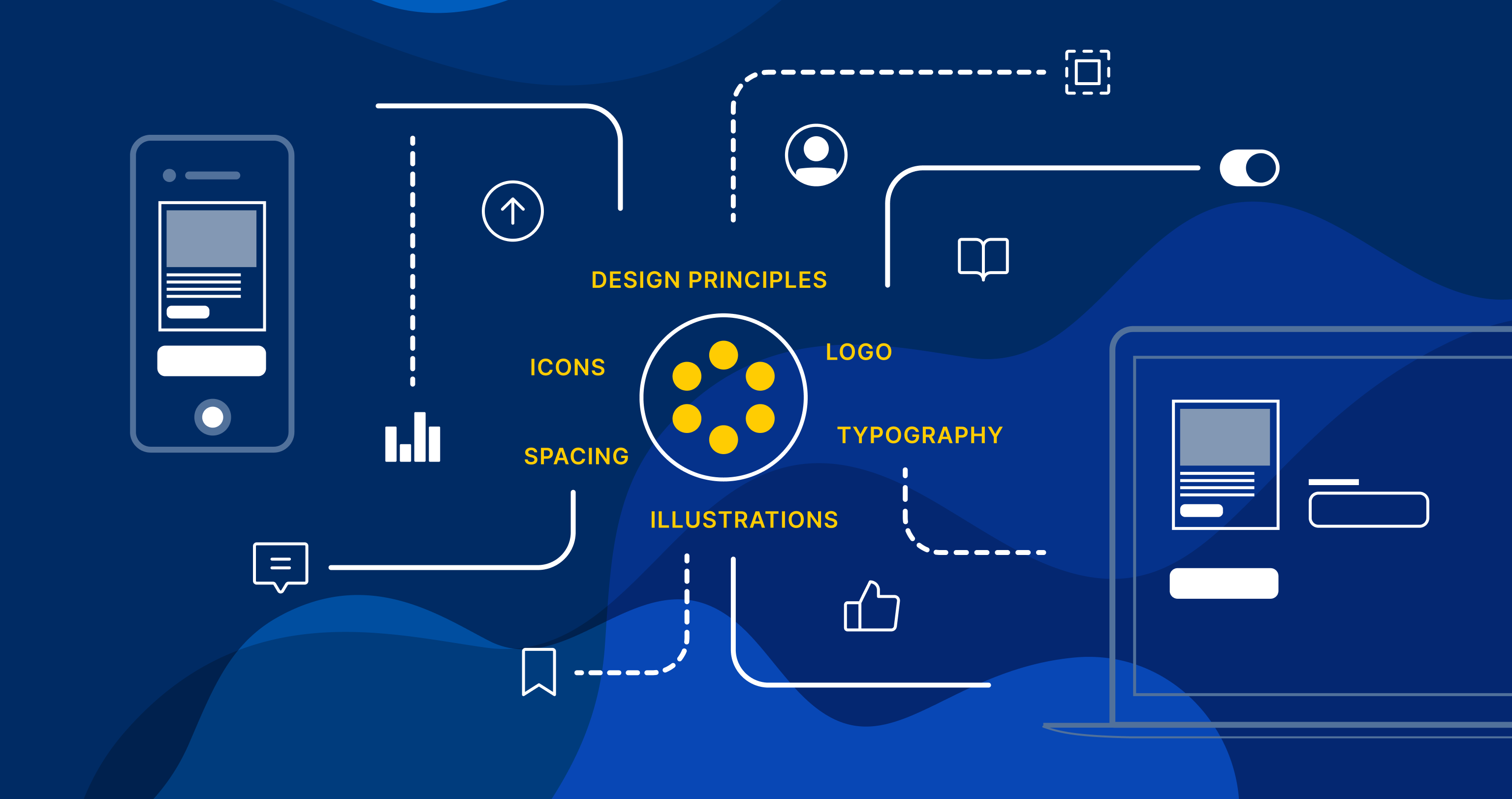
Fundations
It is very important to set and define universal design guidelines and rules before jumping straight into designing your user interface. These will drive the team in the right direction and help your decision-making. Foundations are the brand’s visual guidelines and serve as the main assets during the development of all your components. Inside foundations, you mainly find the following:
- Design Principles
- Logos
- Typography
- Colors
- Icons
- Illustrations
- Spacing
Components
Components are the reusable building blocks of your design system. Each component caters to a particular interaction or UI need, and they are specifically built to create patterns and intuitive user experiences. The common components are:
- Buttons
- Forms
- Cards
- Navigation
- Footer
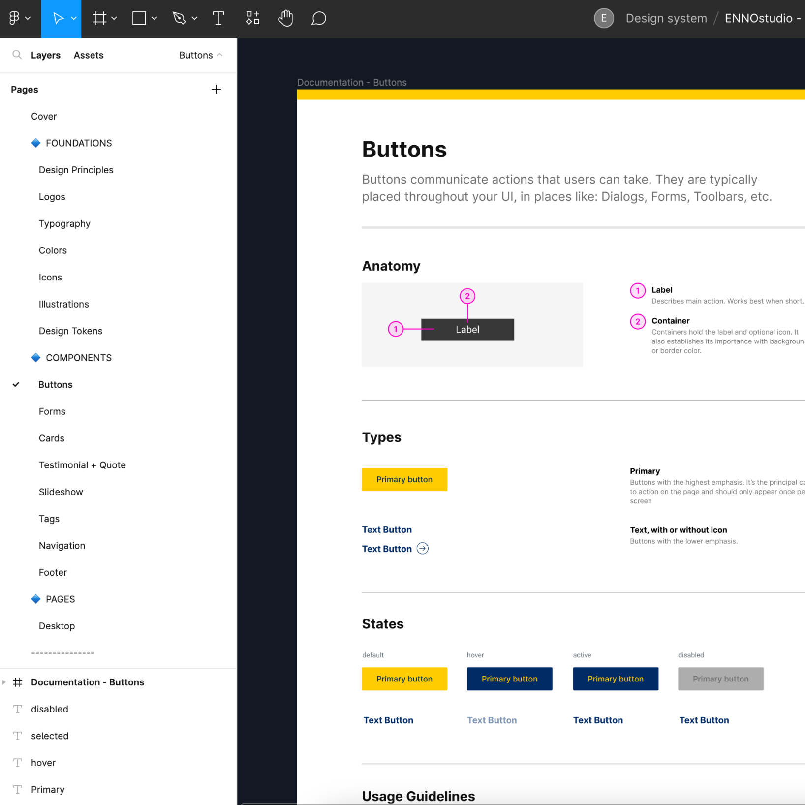
Documentation
Documentation is the regularly updated, how-to guide for design system use. It is the first step toward creating a shared understanding of how an organization builds a design experience. Typically, it includes a page for each component, describing their function or goal, anatomy (structure), design specifications, do’s and don’ts and relevant links for designers and developers.
For designer & developers
The primary users of a design system are developers and designers, so to make their jobs easier include content that will inform them on how to use it. When designers need to work with a design system, it’s important to document how and when each component should be used. This means that designers will have more time to use their brainpower to solve unique challenges, rather than having to use it to reinvent components that are already in use.
Each element should include the following:
- Main description – What is this element? What is its purpose?
- Usage notes – When and where should this element be used?
- Related elements – If this element is similar to another, consider signposting to other related elements. In many cases, depending on the use case and goal, it may be helpful to outline when to use a certain element or an alternative one.
- Visual notes or UX (optional) – Additional notes on interaction with the element or its visual design.
- Dev notes – Additional notes on how the component is put together.
Many organizations also use their design system – depending on its purpose – to catalog the code for each UI element. This allows developers to use it for pulling out standard components, rather than having to build them differently each time they use it. If your design system is intended for use by developers, make sure that you are as comprehensive with the included code and dev notes as you are with design elements. Also try and make the developers’ jobs as streamlined as possible.
Team management & design system governance
Design systems require continuous maintenance and oversight to ensure that they don’t become outdated. The size of the team can vary but at a minimum you should include one visual designer, one developer and one technical writer. Each of these is meant to create visual examples, provide code snippets and write design interaction guidelines.
Design system governance fulfills several purposes:
- It maintains design and brand consistency.
- It prevents poor design decisions that can lead to usability issues.
- It encourages team members to think creatively and to attempt solving problems with the tools at hand before trying to make changes.
- It ensures that updates take accessibility into consideration.
- It keeps the entire organization informed of changes.
- It updates digital product and design documentation.


Adoption
Adoption is the most challenging part when starting a design system. It means using design components for designers or coded components for developers, and also contributing to the design system.
The process can be broken down into three parts:
- Visibility – Creating awareness of the design system as a way of getting people prepared for when they use it.
- Adoption – Getting people to use the design system and have it as part of their workflows.
- Impact – Measuring how well your system has been adopted.
The easiest way to gain visibility around your design system is to take it to people. This means talking about your design system at meetings; your own and those where you are a guest. If you have the budget, you can always create a launch event to introduce your design system and encourage adoption. You can also, for example, create a newsletter to inform your team about new features, updates and add screensharing demos.
After you’ve created visibility around the design system, it’s time to get people to adopt it. One way to do this is through design system champions. They might be guild members, maintainers or senior-level teammates. Whoever you choose, their goal should be to advocate for the system and urge people to use it.
For design teams that use Figma, you can use their analytics to get a sense of component usage, detachment and more. You can conduct code audits to see component usage on the developer side.
Overall, you can measure adoption impact based on how quickly new hires onboard with the system and how soon they start with coding and designing. Consider what metrics your organization values and tie in ways to measure based on them.
Great examples of live design systems
Here are some live examples to inspire you from well-known companies in the world.
- IBM: carbondesignsystem.com
- Shopfiy: polaris.shopify.com
- Kiwi: orbit.kiwi
- Adobe: spectrum.adobe.com
- Atlassian: atlassian.design
- Decathlon: decathlon.design
We hope you enjoy our insights into design systems.
If you’d like to learn more about how design systems could impact your business and your relationship with your customers, write to us.

We are a design and innovation studio creating engaging, accessible digital experiences for everyone. Our team of product designers and strategic consultants combine beautiful design and creative strategies to build and promote user interfaces that make a real difference to people’s lives.
