Design insight
How to know if your design is hitting the UX spot.
Measuring usability with SUM, SUPR-Q and NPS
As designers we often have the question posed to us: Why should I invest in design? As long as a product is functioning, why should I care about investing in user experience and user interface design? And then, once we have answered this question, it is usually followed directly by another: How can I make sure there is a return on investment? At ENNOstudio, we do not believe solely in designing pretty things, nor fully in metrics. For us it’s a blend of making sure customers truly enjoy the digital products we create and ensuring that the company can monetize them.
Why should you invest in digital design?
First and foremost, it’s important to understand the value of investing in good UX/UI but more precisely, to also assess the cost of bad design. We are fond of quoting Dr. Ralf Speth at ENNOstudio: “If you think good design is expensive, you should look at the cost of bad design.”
Clearly, it is quite tricky to quantify bad usability, but the worst case scenario is the loss of a lead – or worse – a customer. Depending on the industry you are in, and given rising acquisition costs, this can become quite pricey for your company. Traditional banks have learned this the hard way in recent years with the rise of challenger banks that focus on good usability.
The numbers back up this assessment, across all industries:
Opportunity
If they have difficulty registering, 45% of users will not bother to do so. When Bank of America was made aware of this by an Adaptive Path study, they immediately understood why they were lagging behind their competition. They remedied the problem and have since noticed a dramatic upswing in usability.
Productivity
Bad UX loses you employees. In 2013, Avon had to pull the plug on a $125 million software overhaul after their pilot in Canada revealed that the iPad rollout was too difficult to use, and a number of sales reps had began to quit the company as a result.
Development
Wasted development time eats into your company finances. The IEEE found that around 5 to 15 percent of all development projects will be abandoned before delivery or shortly thereafter due to poor usability. Overall this amounts to a not-so-cool $150 billion lost, which can be avoided by simply taking a user-centric design approach.
Reliability
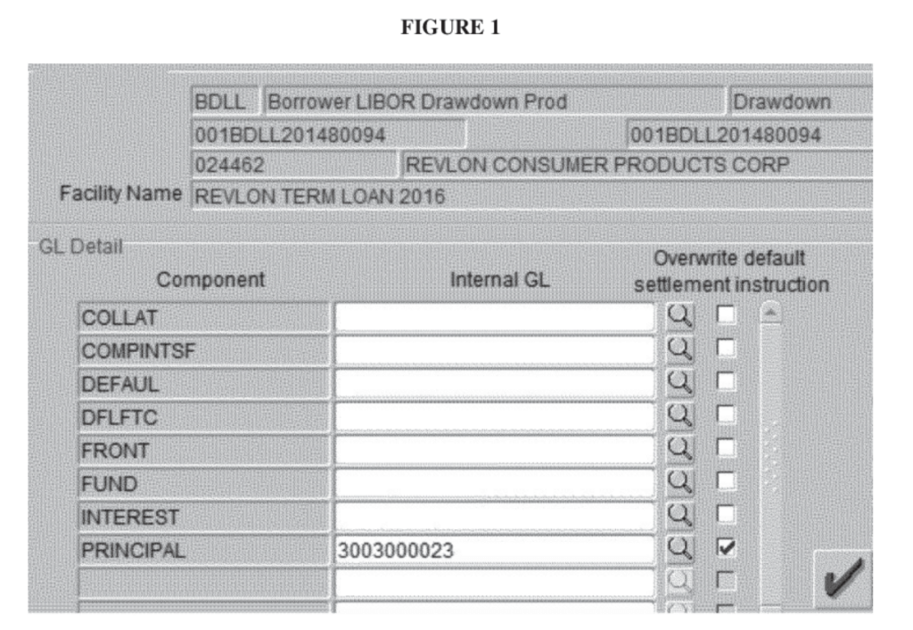
Poor UX causes error. Citibank learned this the hard way back in August 2020. They accidentally wired the full balance on a loan to Revlon creditors, instead of transferring just the interest on that loan. So the lucky creditors received roughly 900 million USD in total instead of 7.8 million. Citibank went to court to try and reclaim the money but were only able to recoup 400 million, which amounts to 500 million of bad UXl.
Net Promoter Score
NPS is a metric that is not employed solely in a usability context. It is also used widely in marketing and product development. In short, NPS measures loyalty and the good thing about it is that it’s relatively easy to calculate. To do so, you need to ask your audience a simple question: “How likely are you to recommend this website/product to someone else like a colleague, friend or relative?”
NPS is computed by asking people to provide an answer to the question: On a scale of 0 (not at all) to 10 (definitely), how likely are you to recommend us to a friend or colleague?
The resulting mark corresponds to one of the following categories:

1 to 6 = Detractors
This indicates dissatisfaction and criticism and little chance of recommendation.
7 or 8 = Passives
This indicates moderate satisfaction but lower likelihood of recommendation.
9 or 10 = Promoters
This indicates high satisfaction and a very strong likelihood of recommendation.
Once the responses of the audience have been collated, NPS is calculated by subtracting the % of detractors from the % of promoters:

Please note the following:
- NPS is an integer ranging between -100 to 100
- The calculated score should never be represented as a percentage
- The passives are included in the total number of respondents, but do not contribute to the score
NPS has the following limitations:
- It will not capture the full picture when used as the only measure, as while it tells you how your site is doing, it does not give you the ‘why’ it is performing to a certain level. For it to be effective and offer a complete picture of user experience, NPS should be accompanied by other performance metrics, such as task success rates and task times. Customer ratings for varying reasons are also not a reliable indicator.
- It is only reliable as a measure with large sample size. Many entities plough through with small sample sizes and even base their design decisions on them, paying scant regard to their lack of statistical validity.
- It oversimplifies data and does not figure in a respondent’s self-belief and drive. While this is not exclusive to NPS as a measure, it misses information by rigidly grouping respondents into three bins (promoters, passives, and detractors), which means passives are discarded. Even when sample sizes are increased to garner the most significant data, researchers often can’t see the full meaning behind a respondent’s score.
SUPR-Q - Standardized User Experience Percentile Rank Questionnaire
SUPR-Q, beside having a superhero name, has become a solid reference in the design world over the last few years. It was developed by Jeff Sauro, PhD, in his paper:
“SUPR-Q: A Comprehensive Measure of the Quality of the Website User Experience.”
SUPR-Q was developed through a process called psychometric qualification, with data collected both during usability tests and retrospectively in surveys. Basically a score is calculated according to a set of 8 standardized questions that measure someone’s perception of the user experience, more specifically usability, trust and credibility, appearance, plus loyalty. As previously mentioned, part of these questions rely on NPS.
Usability
- Is the website/product easy to use?
- Is it easy to navigate within the website/product?
Credebility
- Is the information on the website credible?
- Is the information on the website reliable? / Do I feel confident conducting business with this product?
Appearance
- Do I find the website/product attractive?
- Is the information on the website reliable? / Do I feel confident conducting business with this product?
Loyalty
- How likely am I to return to the website/product in the future?
- How likely am I to recommend the website/product to a friend, relative or colleague?
You should then average the scores out over all categories. For the Loyalty category, in order to convert to the Likert scale (since the answer is on a 1-10 scale), you have to divide the score for this NPS-type question by 2 before you calculate the average in this category.
Raw SUPR-Q Score = ((sum of responses excluding NPS)/7) + (NPS response/2) or

Once calculated, the Raw score can be translated into a percentile score, which can be compared with scores stored in other SUPR-Q databases.
SUM – the single usability metric
The SUM score was firstly introduced in a paper presented at CHI 2005: “A Method to Standardize Usability Metrics into a Single Score” by Sauro and Kindlund 2005 (available here https://measuringu.com/papers/p482-sauro.pdf). It’s basically the ISO of usability. The SUM is a standardized UX metric focusing on the cornerstones of usability: effectiveness and efficiency. Sauro and Kindlun paired the task-level metrics of SUM to each ISO definition component: completion rates (optionally error rates) for effectiveness, time-on-task for efficiency, and a questionnaire for satisfaction using three 5-point Likert questions.
The SUM score takes into account the metrics for completion, time, sat, errors and clicks, and then combines them. Certain providers, such as MeasuringU, take charge of the interviews and software to get a combination of all the results – https://measuringu.com/services/muiq/ – however, this is subject to a charge.
We are fundamentally a lean agency at ENNOstudio and believe in hacks. You can find here the excel sheet with the formula to generate the SUM score. Here is the approach we recommend for task-based measurement:
- Gather a panel of users (the magic number is 5 according to Landauer & Nielsen). Adding more than 5 users will provide you with less and less information because the same answers will crop up again and again.
- Define tasks that can be completed by the users. Dumas and Fox (2008) give a perfect overview of tasks that are a good basis for usability testing:
- Tasks that are important, such as frequently performed tasks or tasks that relate to important functions
- Tasks where designers predict that users will experience difficulties
- Tasks that enable a more thorough examination of the system, such as those that can only be accomplished by navigating to the bottom of the system hierarchy, or tasks that have multi-links or shortcuts
- Tasks that influence the business goals of the company
- Tasks that examine re-designed areas
- Tasks that relate to newly-added features
- Define the goal(s) of the testing: It is important to ensure the description is realistic, that it has the right level of detail, and that it avoids ambiguity. Also consider putting tasks in order – especially if there are dependent tasks. For example: Create an account on this travel platform and book a flight from Paris to Berlin or Login to your mobile bank account and wire 9.000€ from your savings to the account of Guillaume Vaslin (IBAN DE96 0000 1111 2222)
- Gather the metrics. Record the panel satisfaction rate (from 1 to 5), the completion (0 for failed, 1 for completed), the average time (in seconds) and the error count (0 to infinity). How do you calculate satisfaction? ENNOstudio recommends using the 5-point Likert scale. We basically ask how much a person agrees or disagrees with a particular statement or question. For example:
So far, I’m learning from this article:
- Strongly disagree
- Disagree
- Neutral
- Agree
- Strongly Agree
You can also use the 3-point or 9-point Likert scale, however, per experience the 5-point has more accuracy without overwhelming the user.
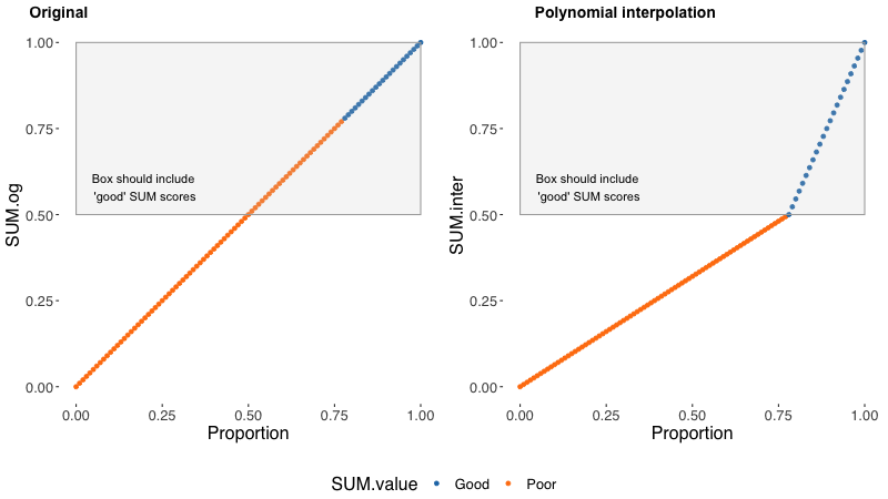
- Calculate the SUM. Employ the very useful Excel sheet developed by Measuring Usability LLC to crunch the numbers and calculate the SUM score. For the researchers out there, we strongly recommend having a look at the essay by Carl J. Pearson, PhD, challenging the SUM calculation. It uses the variance of Bernoulli (polynomial interpretation) to improve the accuracy of the SUM scoring result.
All these methods are an excellent way to begin assessing the usability of your digital product. Naturally, the most important thing is to actually get started. A simple tracking of the conversion rate is a good first step. The evolution of the metrics here will be the best basis for understanding the value of your design efforts.
If you want to know more about how to improve your experience, please feel free to get in touch with us.

We are a design and innovation studio creating engaging, accessible digital experiences for everyone. Our team of product designers and strategic consultants combine beautiful design and creative strategies to build and promote user interfaces that make a real difference to people’s lives.