Happy.news is a platform for creating joyful personalised greeting cards using images, videos, and GIFs — turning treasured moments into shareable keepsakes. What sets it apart is the reply feature, which enables heartfelt conversations around the cards. When their team approached us to improve the user experience and reduce drop-offs, we were very excited at the chance to support their mission with our design expertise.
The Challenge
Our Mission: More Clarity, More Connection, More Excitement
Happy.news already had an established visual identity, so a strong foundation was firmly in place. The task, therefore, was really about thoughtful refinements. We didn’t need to reinvent the brand but rather to enhance the experience within the existing design framework.
In addition to updating the UI with fresh applications of the brand’s colours and fonts, we also refined key aspects of the user experience — most notably the response feature, which we made more intuitive and emotionally resonant. One of the main challenges was working within the given visual elements, while still making the interface feel livelier and more user-friendly. It was a careful balance between consistency and meaningful innovation — and one we were excited, as always, to take on.
Mobile at the Core: Redesigning UX for Maximum Engagement
With over 78% of traffic coming from mobile devices, one thing was clear from the start: A mobile-first mindset had to lead the way!
We began with an in-depth UX audit; closely examining the most critical user flows across both desktop and mobile. Using a combination of existing analytics and our own user experience insights we identified pain points, usability gaps and areas of friction. But we didn’t stop there, because our goal was to translate those findings into clear, actionable recommendations. The result: A smoother, more intuitive journey that not only improves usability but also creates a more emotionally engaging experience throughout.
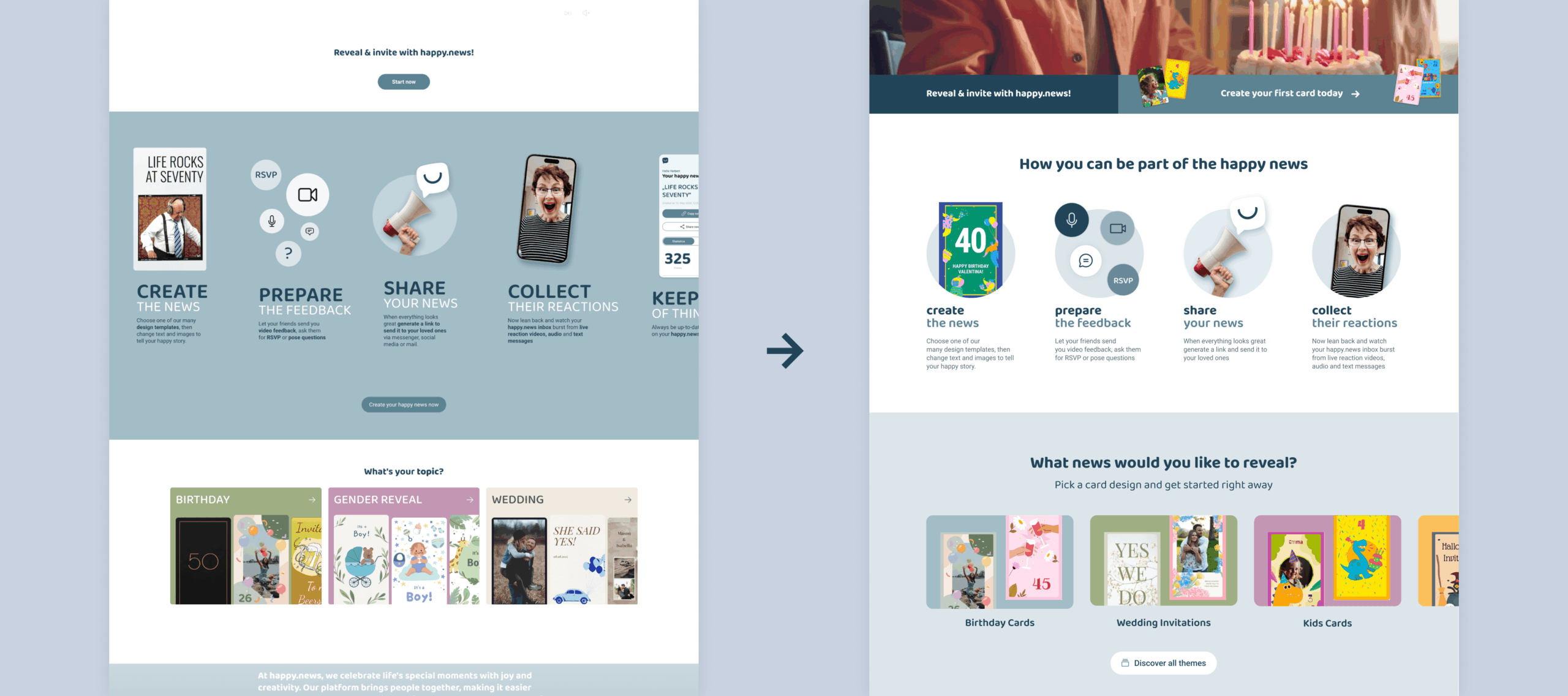
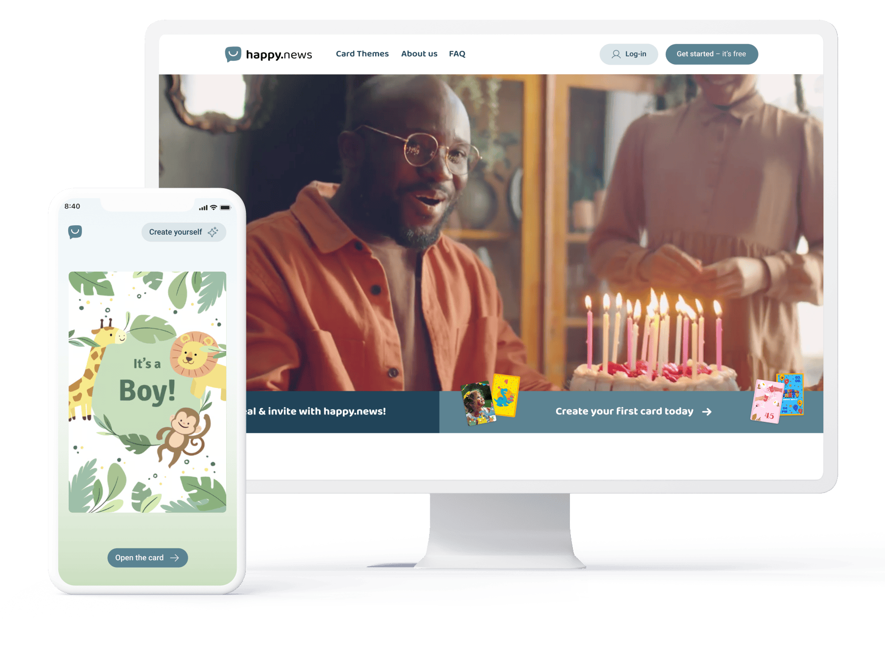
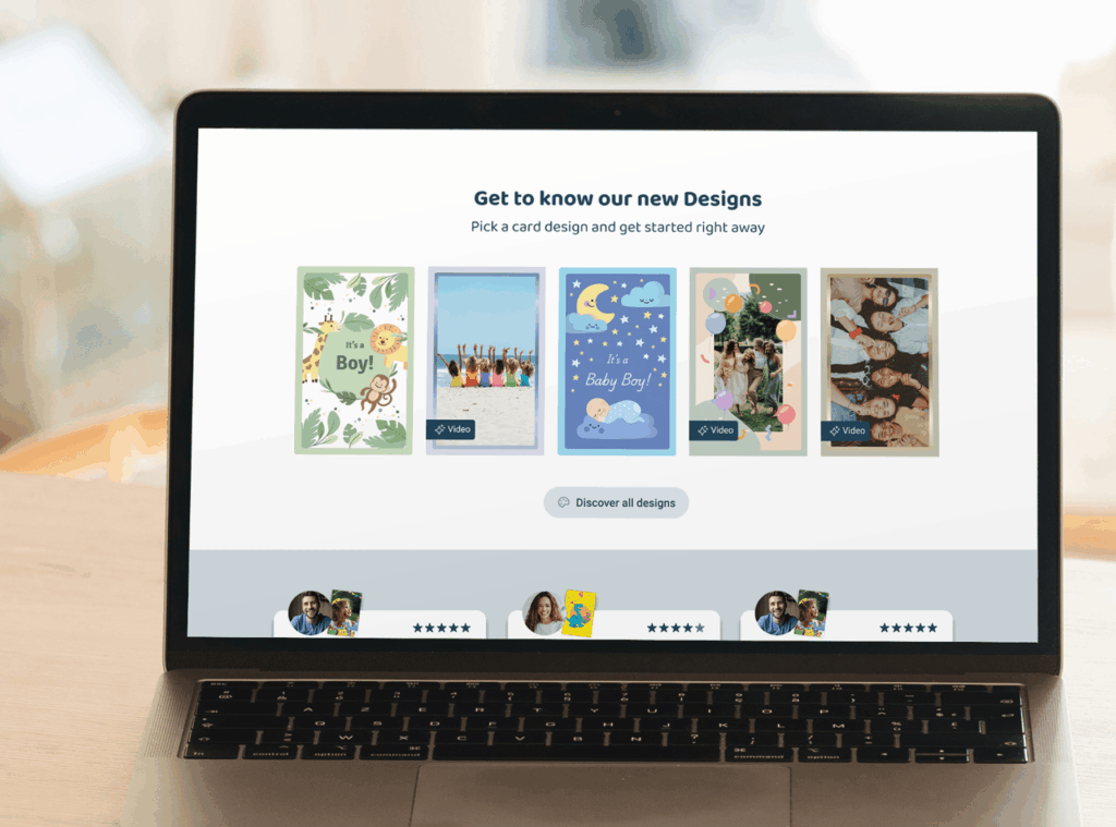
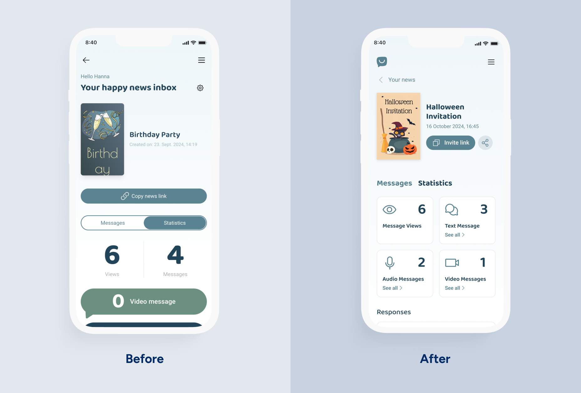
A glimpse of the landing page — before and after redesign
UX Improvements
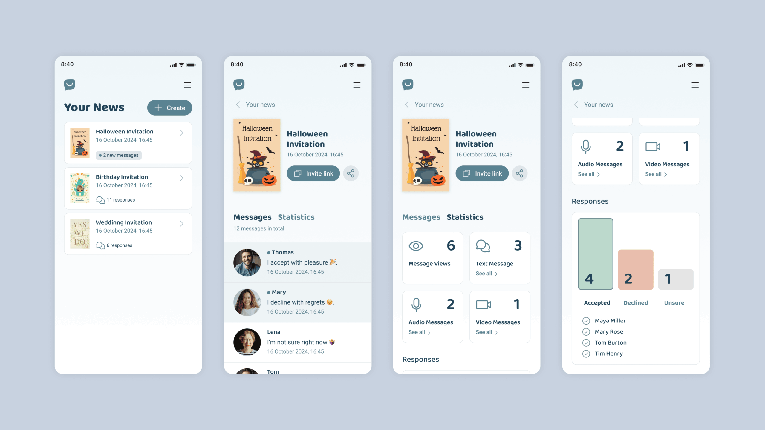
Engagement and Clarity: Optimising the "Your News" Dashboard
For the “Your News” dashboard we reimagined the layout; transforming the experience into one that’s not only easy to navigate but also emotionally engaging. We simplified the display of statistics – making them instantly digestible – while at the same time sprinkled in playful icons that invite users to feel more connected to the content.
We implemented a modular card-based layout to further improve orientation and hierarchy. This gives the dashboard a clearer structure, which allows for a more meaningful grouping of information. A key improvement was replacing the existing long, scroll-heavy list of responses. Instead, we grouped different types of replies (video, audio, text) into interactive cards — making the experience cleaner, as well as more dynamic and inviting.
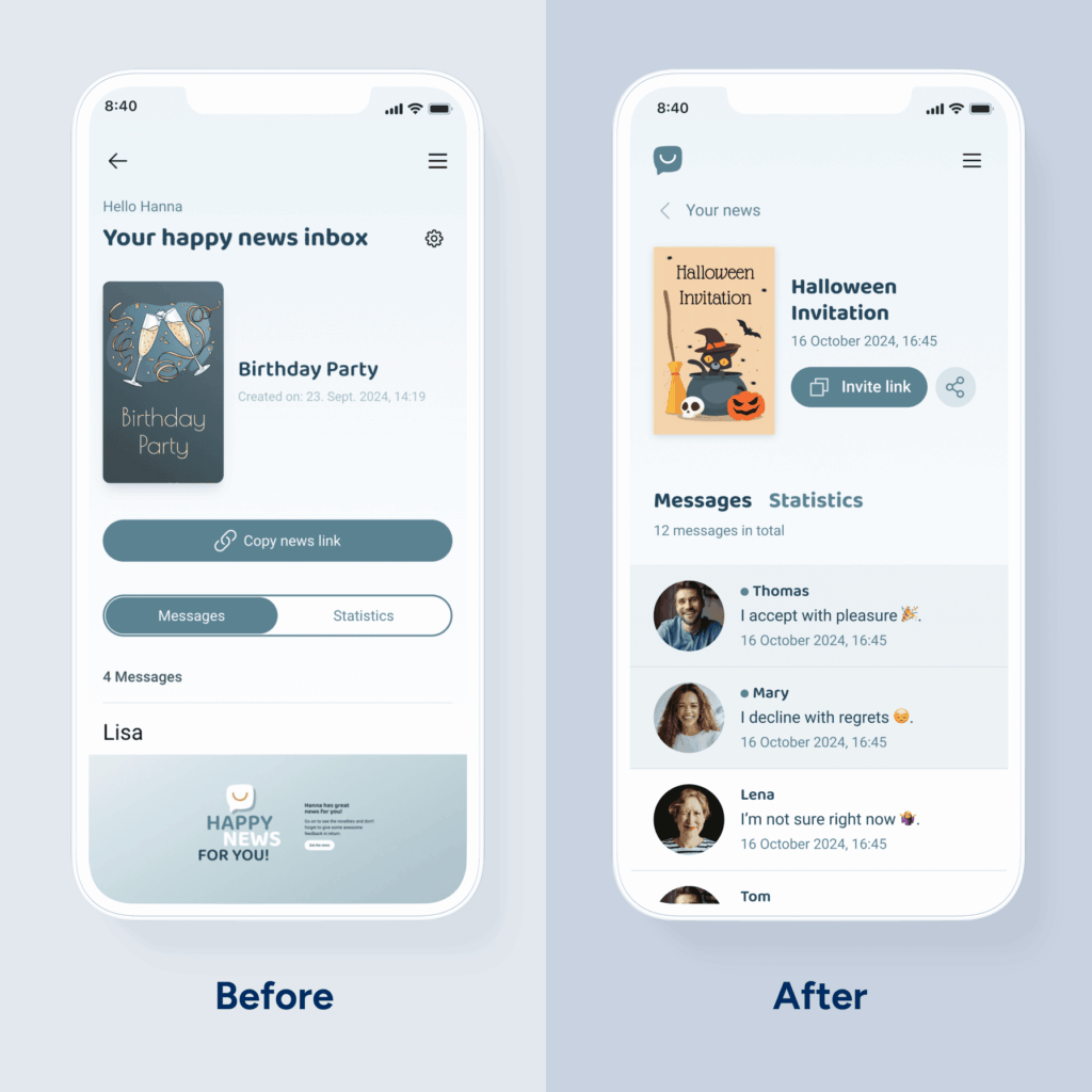
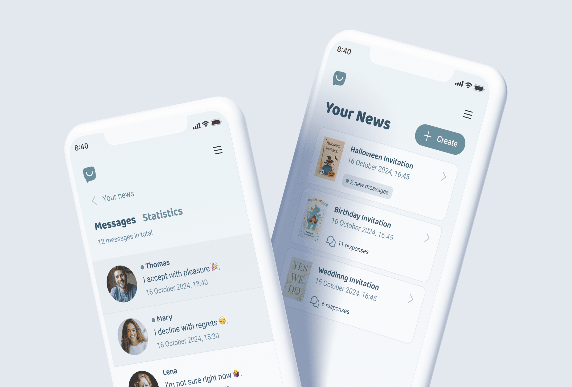
User flow — from the "Your News" overview to the detailed dashboard
UX Improvements
Higher Response Rates and User Satisfaction: Redesigning the Feedback Flow
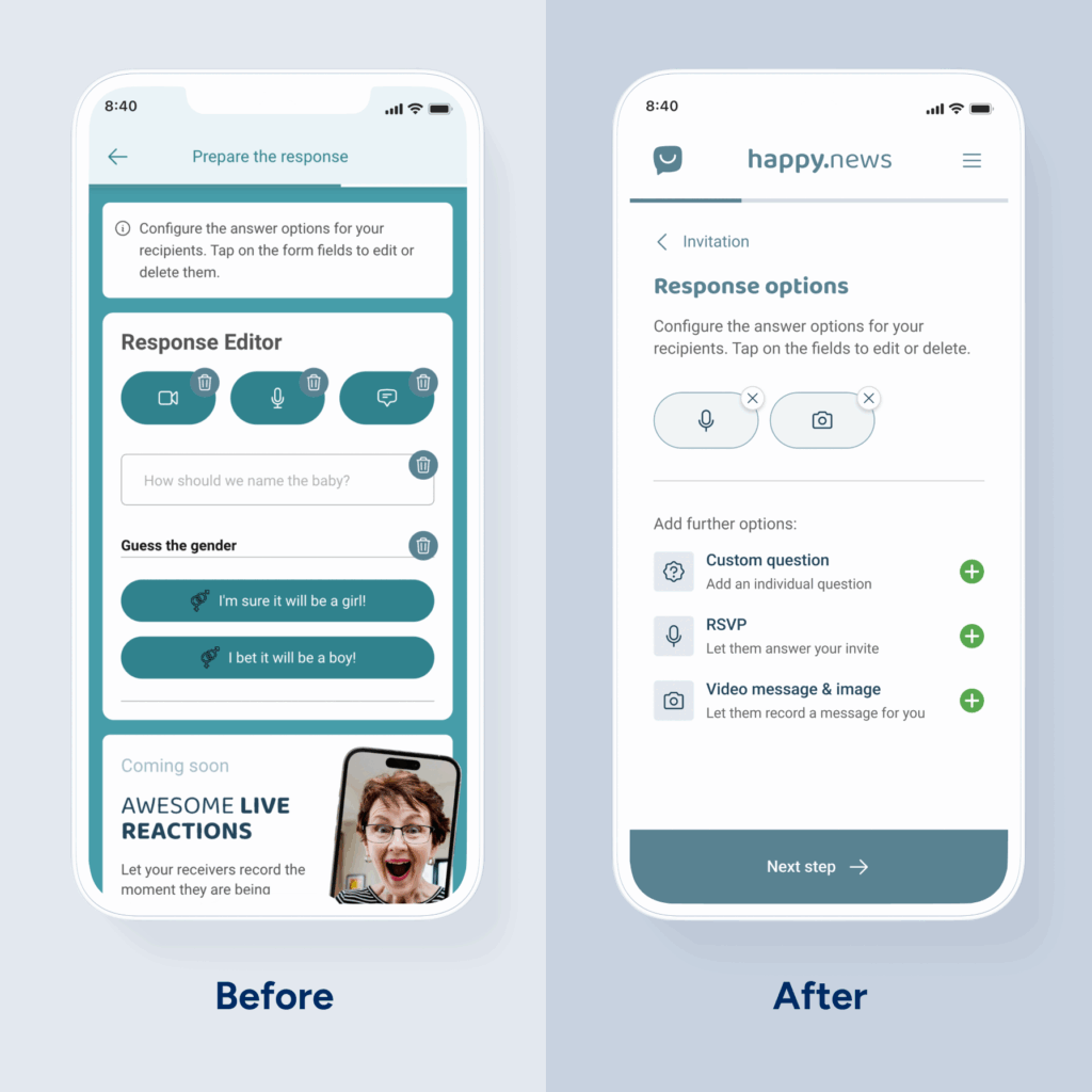
One of the biggest friction points in the existing user journey was the feedback flow — a moment that should foster connection but instead felt messy and overwhelming. The design was overloaded: Too many colours, poor contrast and long scrolling pages filled with dense text. It created cognitive overload, which made it hard for users to focus or engage.
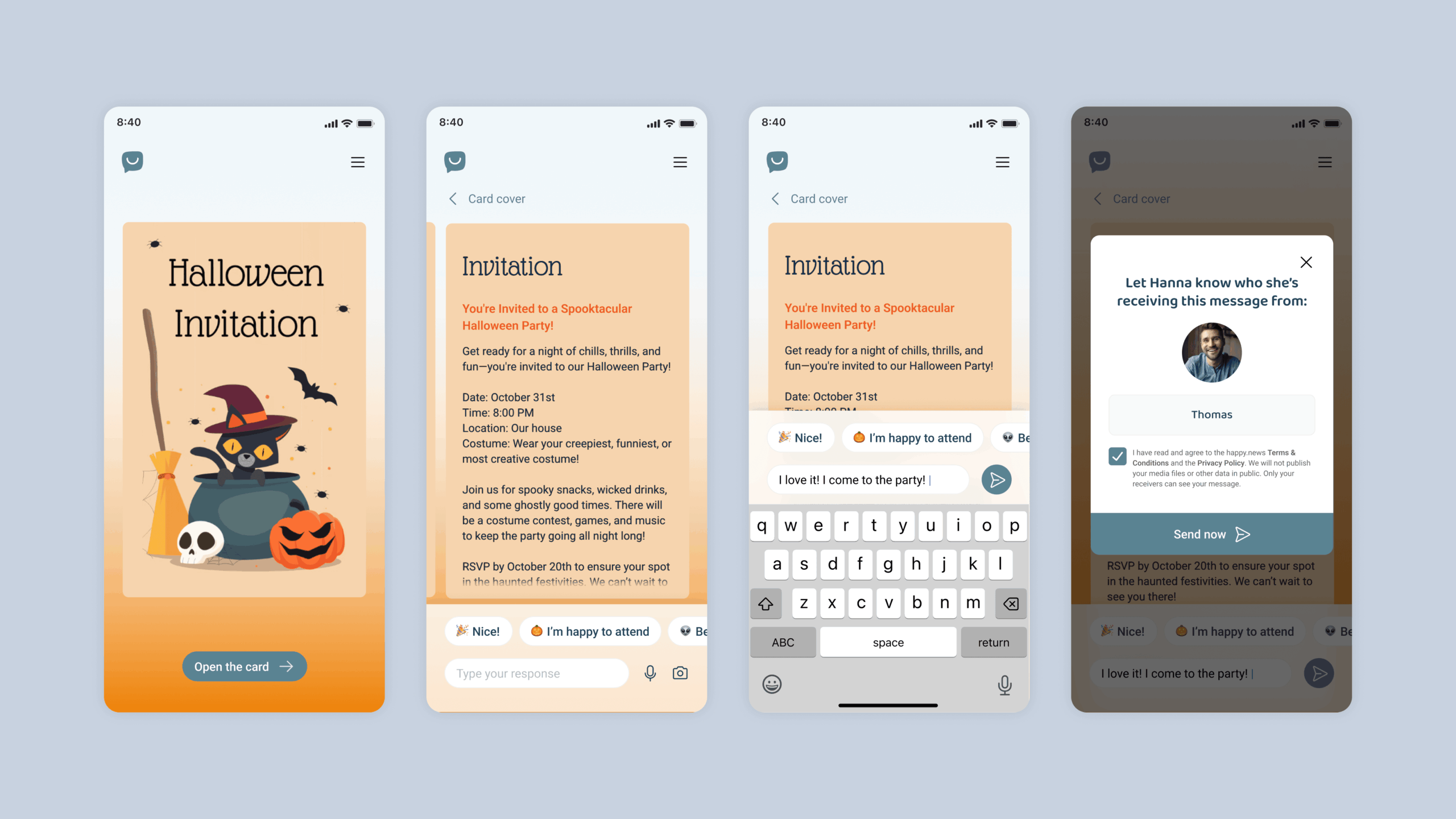
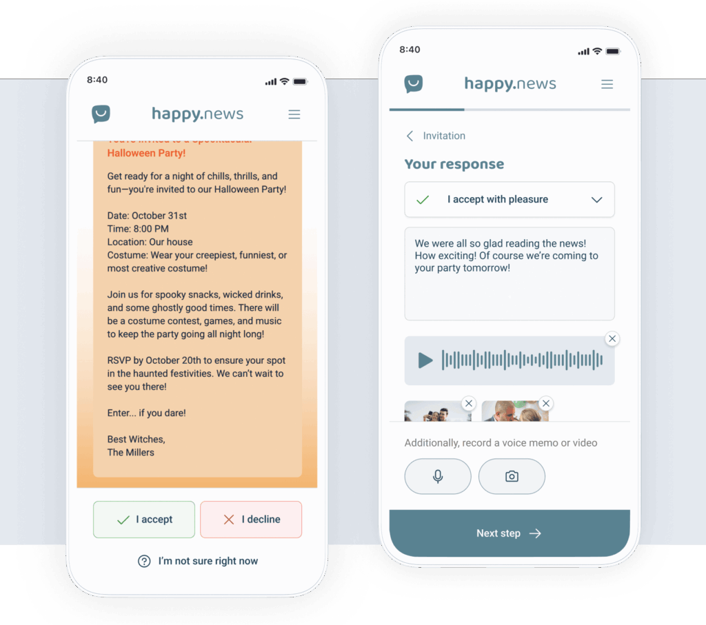
We solved this by having fewer CTAs, simplifying the colour palette for better accessibility and by eliminating visual clutter. Most importantly, we introduced a wizard-style flow — one clear question per screen, guided step-by-step, with a visible progress bar. We also introduced a forward-looking “North Star Flow” version: A conversational, chat-like experience that replaces static forms with intuitive, human interactions. The result: A shift from frustration to fluidity — a feedback process that’s simple, engaging and much more likely to convert.
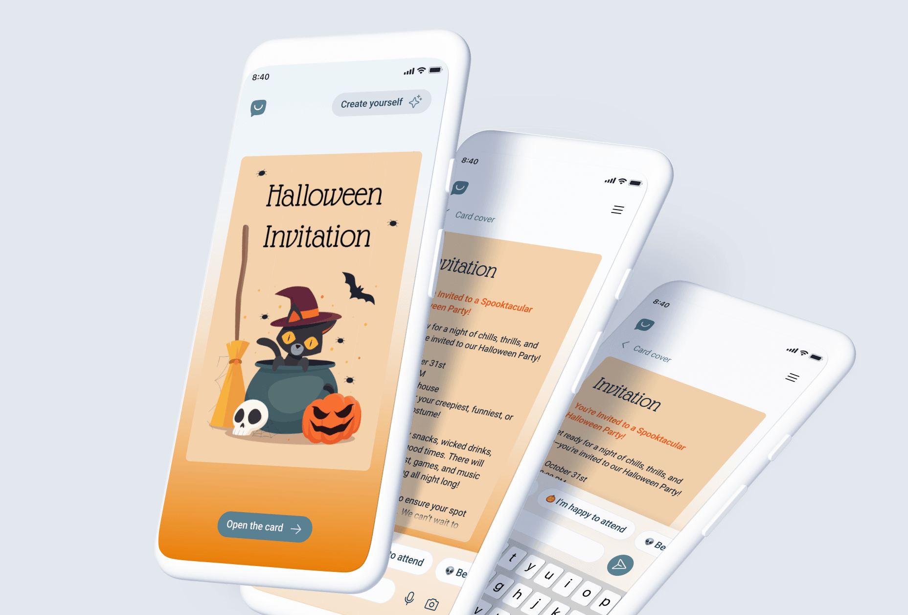
“North Star Flow” for receiving news — from opening the invitation card to crafting and sending a response
Impactful Adjustments
From Clutter to Clarity: A Strategic Redesign for Impact
We streamlined and strengthened the happy.news platform with targeted UX and design enhancements; improving both usability and brand alignment without compromising its core identity.
Stronger Brand Focus: A simplified visual design and reduced colour palette sharpened the platform’s branding and increased visual clarity.
Improved Readability: Higher contrast and clearer visual hierarchy enhanced content legibility across devices.
Optimised User Flow: Refined navigation and intuitive interaction patterns reduced friction and guided users more efficiently.
Enhanced Engagement: Fullscreen video, interactive elements and bold visuals increased user interaction and time on site.
Colors
#224459
#5c8392
#a3bdc6
#dce6ea
#f5d5ad
Font
Roboto
A Á B C D E É F G H I Í J K L M N O Ó Ö Ő P Q R S T U Ú Ü Ű V W X Y Z
a á b c d e é f g h i í j k l m n o ó ö ő p q r s t u ú ü ű v w x y z 1 2 3 4 5 6 7 8 9 0
Aa
Light
Aa
Regular
Aa
Bold
The little prince went to see the roses again: "You are not at all like my rose, you are nothing yet", he said to them. No one has tamed you and you have tamed no one. You are like my fox was. It was only a fox like a hundred thousand others. But I have made him my friend, and he is now unique in the world."
“With ENNOstudio we have realigned happy.news: after a comprehensive audit and initial ideas, they optimized the landing page and the feedback flow for us with a cool new brand design.”
Mario Reichenbach
CEO and founder of Happy News GmbH
What we Learnt
More than an Update: A Measurable UX Upgrade
Our work with happy.news went beyond a visual refresh. We delivered a significantly improved user experience with streamlined navigation, more intuitive interactions and a design that enhances both usability and emotional engagement. For us at ENNOstudio, it’s always about creating design that performs — clear, purposeful and aligned with user needs. Helping transform digital greeting cards into engaging, memorable experiences is the kind of challenge that defines our work.
Some of our work
Check out our portfolio.
Some of the memorable experiences that we already created together with our clients.