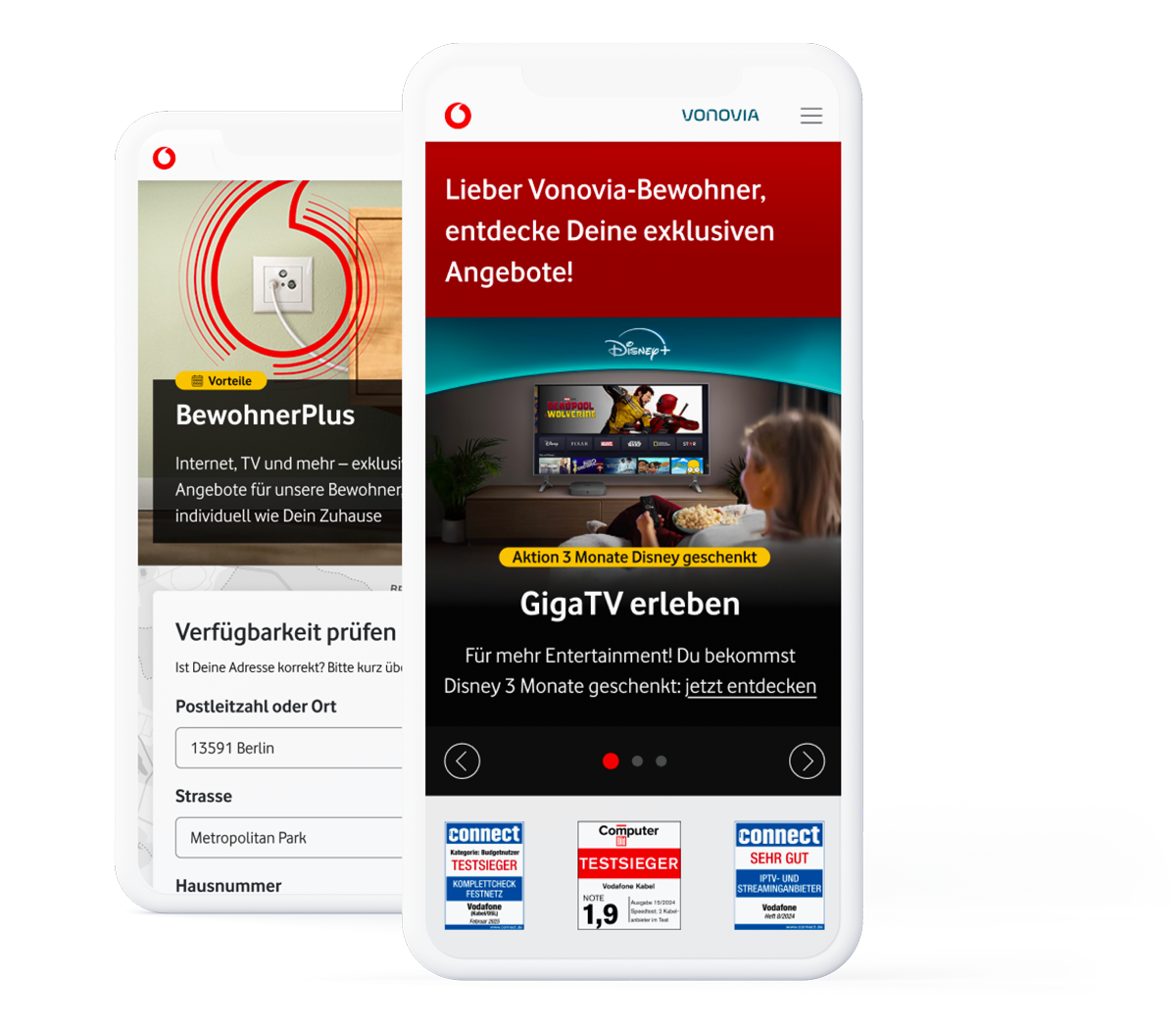
As part of a comprehensive Vodafone redesign we focused on two critical product flows: the new build order route and the real estate disruption form. Our aim was to improve user-friendliness, reduce bounce rates and increase the conversion rate.
The Challenge
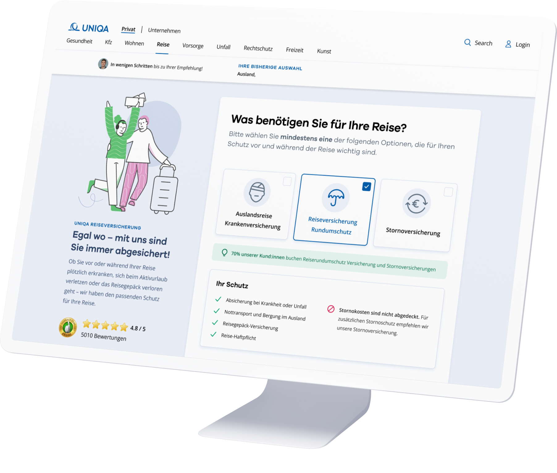
Conversion rates at a glance: The redesign of Vodafone’s product flows
Vodafone is an industry-leading integrated telecommunications company and the largest TV provider in Germany. Vodafone Immobilienwirtschaft is a part of this concern and has for many years been a network operator running alongside the company’s real estate division for housing companies, developers, owners and property managers. We embarked on a complex redesign of two critical product flows for the project, which necessitated an in-depth examination of customer-centric design principles. The goal was to create an improved user experience for Vodafone Immobilienwirtschaft in terms of reducing bounce rates and increasing conversion rates.
Flow analysis, redesign and integration into the Vodafone Design System
Our first step was an in-depth analysis – using so-called user flows – of the existing customer journey of both product routes. Using this schematic form of representation allowed us to gain an overview of both the existing navigation structure and the information architecture of each route. We then designed new flows combining the design system from vodafone with SEO-friendly, digestible content. Development was based not only on the UI elements of the product routes but also on an upgraded visual communication through the integration of motion designs. The focus of our optimization was on clear communication and user guidance for demanding processes, for example, on uploading documents. The result has been a development of two routes that intuitively draw users’ attention to the information to be provided so that they feel supported and taken care of at all times.
Motion Design
Storytelling through animation
In both the construction order and the fault form processes, we present users with creatively designed animations that serve to intensify interaction with Vodafone services in a lively and appealing way. These animations have been specifically developed to add a playful and positive aesthetic to what is often perceived as the mundane process of requesting a new build, or the potentially frustrating experience of reporting a fault. The aim is to not only cover functional aspects but to also create a welcoming atmosphere that encourages user engagement and evokes a positive emotional response.
Creative Process
Transformative design of new construction order route and fault form
The new construction order flow was designed intuitively to make it easier for apartment building owners to apply for a cable connection. At the same time, we also revised the fault form to provide customers with optimum support when reporting TV, internet and telemetry faults. Visual communication has been enhanced by the incorporation of motion designs that convey information more clearly. In addition to simplifying the user experience, the aim of both routes was to optimize the quality of user input for further internal processing. In addition to revising the visual interface, we achieved this by clarifying and simplifying the UX communication. The starting point was the target group and, thus, the translation of technical language into easily understandable and authentic user language. The result is an optimized user experience that minimizes customer frustration and, thereby, reduces bounce rates.
Product Strategy
User-centered change for increased efficiency and higher conversion
Our product strategy was focused on aligning UX/UI improvements with Vodafone’s overall business goals. With the creation of efficient solutions, we expect to not only improve user experience but also to accelerate the actual path to conversion. This action has also been reinforced by the seamless integration of our solutions into the Vodafone Design System. By bringing together creative innovation and proven design principles, we have not only enabled a harmonious integration into the existing Vodafone aesthetic, but also offered a clear focus on the achievement of business goals.
Colors
#e60000
#ffffff
#4a4d4e
#25282b
#0096ad
Font
Open Sans
A Á B C D E É F G H I Í J K L M N O Ó Ö Ő P Q R S T U Ú Ü Ű V W X Y Z
a á b c d e é f g h i í j k l m n o ó ö ő p q r s t u ú ü ű v w x y z 1 2 3 4 5 6 7 8 9 0
Aa
Light
Aa
Regular
Aa
Bold
The little prince went to see the roses again: "You are not at all like my rose, you are nothing yet", he said to them. No one has tamed you and you have tamed no one. You are like my fox was. It was only a fox like a hundred thousand others. But I have made him my friend, and he is now unique in the world."
“The individual form solutions (developed by ENNOstudio) can be easily transferred to future product lines as best practice […] Their quick and professional work, short response times, and willingness to go the extra mile were impressive.”
Aba Koikkara
Head of Digital Acquisiton & Sales - Vodafone GmbH
Learnings
Continuous improvements from analyzing changed user flow
The knowledge gained from the revision of the new construction order route and the fault form now serves as the basis for continuous improvements. Individual form solutions can be easily transferred to future product lines as best practice. This ensures that our solutions keep pace with user expectations while still remaining reliable and relevant. Our commitment to refining the digital experience is a constant as we navigate the ever-changing landscape of UX/UI design.
Some of our work
Check out our portfolio.
Some of the memorable experiences that we already created together with our clients.