Built by Austrian winemakers, Winealyze was created to provide winemakers with a powerful tool for comprehensive management and documentation of the wine-growing process. Initially, the Winealyze team focused heavily on technical features but this meant ease of use for customers was overlooked. In a complete redesign, we restructured the information architecture, created a seamless navigation experience and optimized workflows for intuitive use. Our goal? To turn complexity into clarity and make Winealyze not just a tool for users, but one that really works hand-in-hand with them.
The Challenge
Turning complexity into intuitive experiences
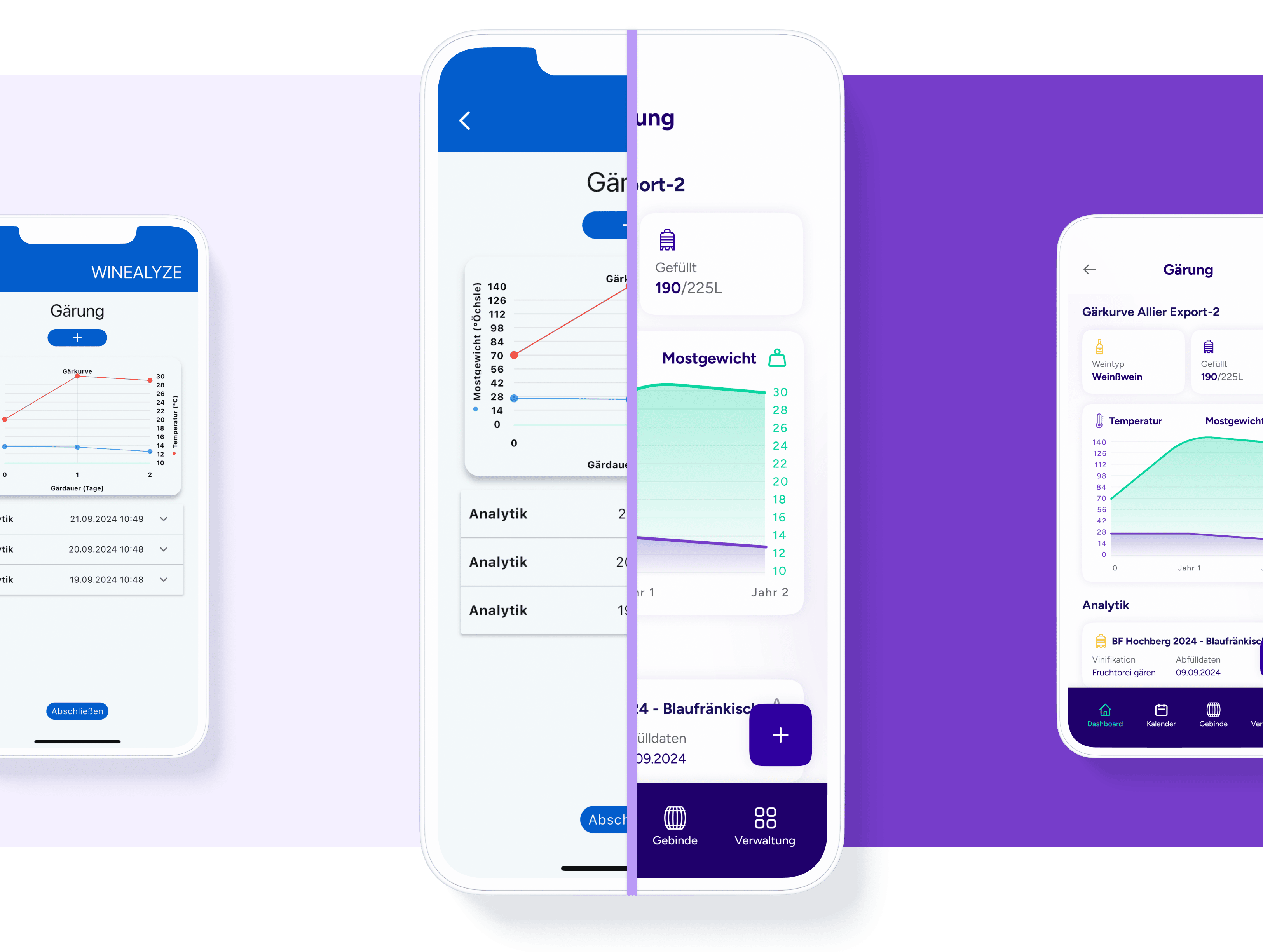
Winealyze is more than just a software solution – it’s a tool that supports the art of winemaking. However, during development, we realized that navigation within the app was not very intuitive. Managing vineyards, tracking production and planning tasks were more complex than necessary.
To change this, we analyzed real workflows and anticipated the needs of users. We restructured the three main usage flows – setting up vineyards, planning tasks and managing wine batches – so that they would feel more natural and seamless. Every interaction was optimized to remove obstacles and ensure a smooth experience from the very first engagement. The result? A streamlined, user-friendly interface that allows winemakers to focus on their craft – without having to wrestle with the software.
Client
Winealyze
Services
UX/UI Design, Prototyping, Customer Journey Mapping, Wireflows, Change Management, Handover to Development
Winemaking is a craft that demands precision. Each production step – from vineyard care to bottling – shapes the final product. The Winealyze app needed to reflect this level of clarity; making complex workflows effortless for winemakers and their teams.
So, we focused on four key aspects to achieve this: seamless documentation of every step, structured task and team coordination, insights from past processes to refine future vintages and intuitive templates for quick, efficient data entry.
In close collaboration with Winealyze, we explored two alternative information architectures and tested ways to make navigation more intuitive and workflows more fluid. What happened? We created a clear, structured system that equips winemakers with the right tools – meaning less time with the software and more time perfecting their craft.
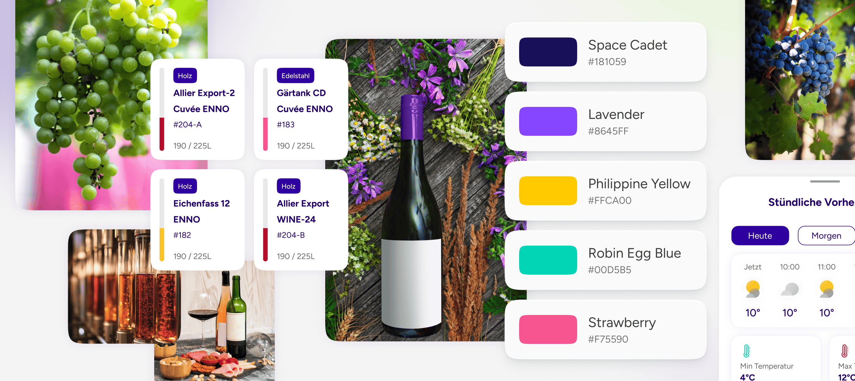
Winealyze Moodboard – Capturing the Essence of Winemaking Excellence
Product strategy
Streamlining work, simplifying winemaking
Great tools should work effortlessly in the background, allowing users to focus on what truly matters. Working in close collaboration with the development team, we not only refined the app but also made it more intuitive. New features, such as employee management and a calendar, now help teams stay organized and allow for smooth workflows.
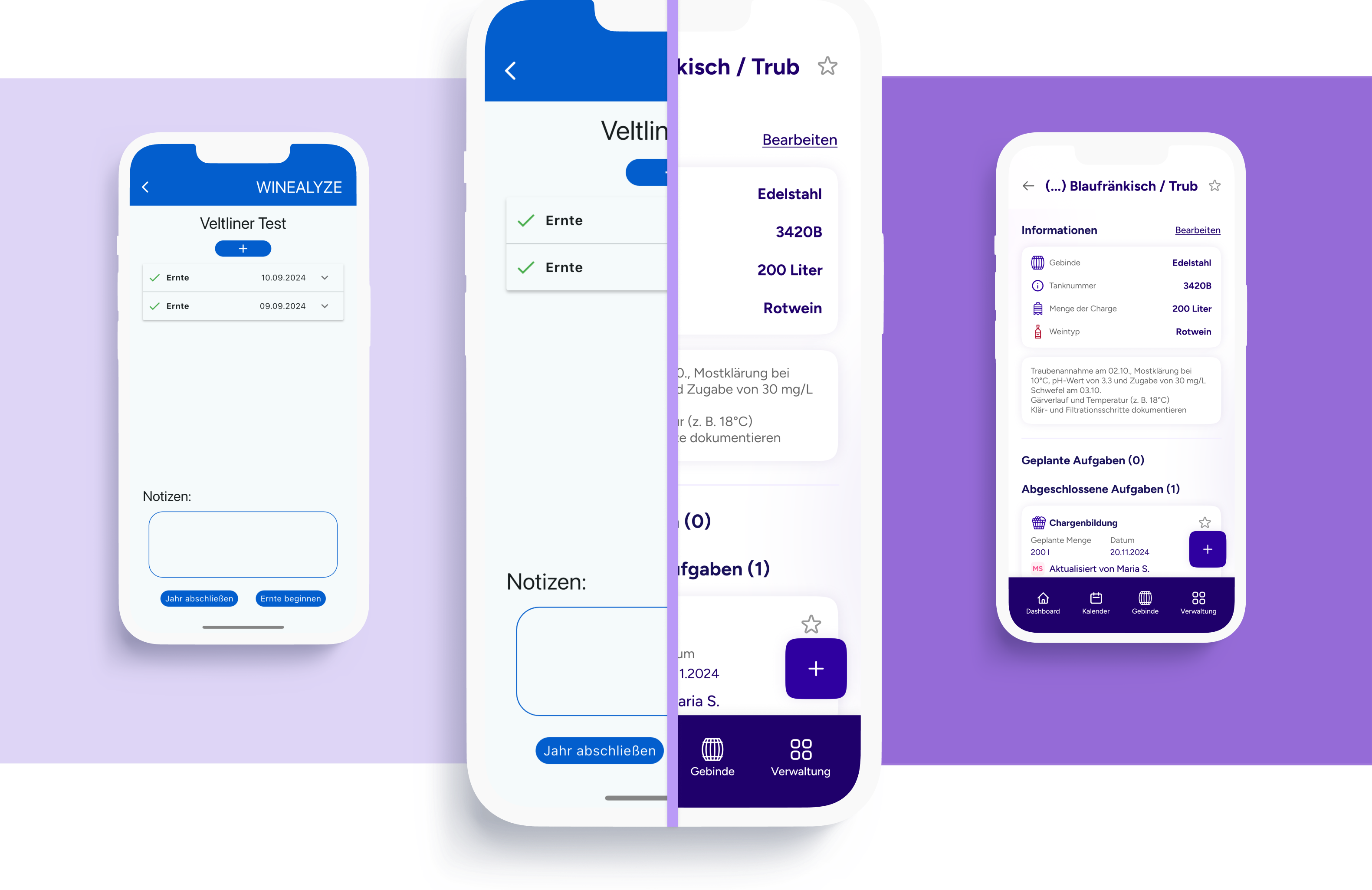
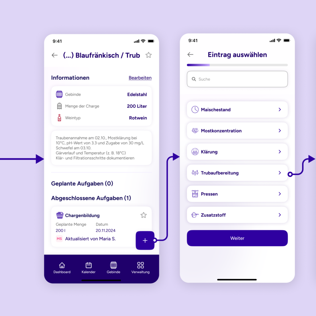
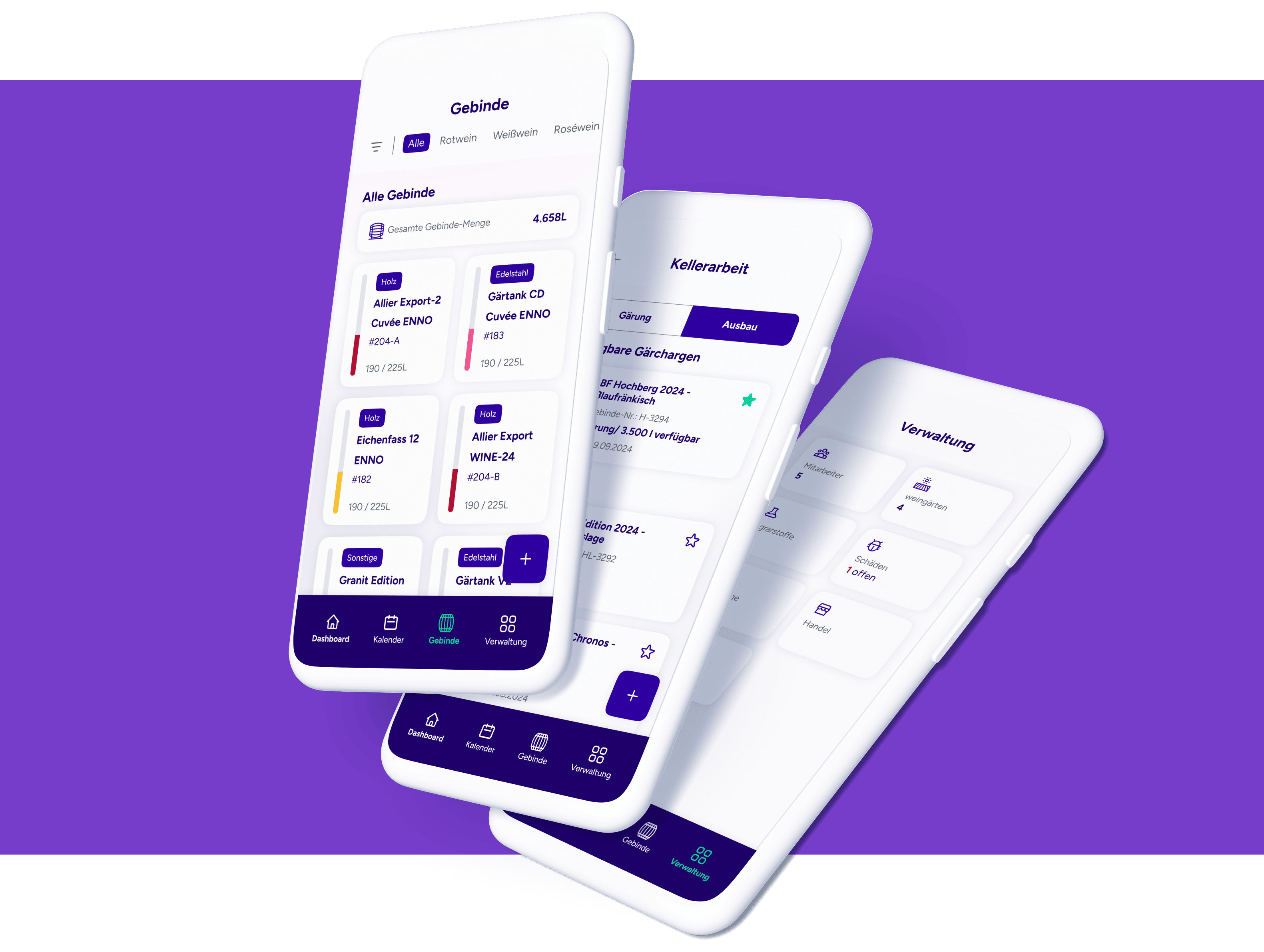
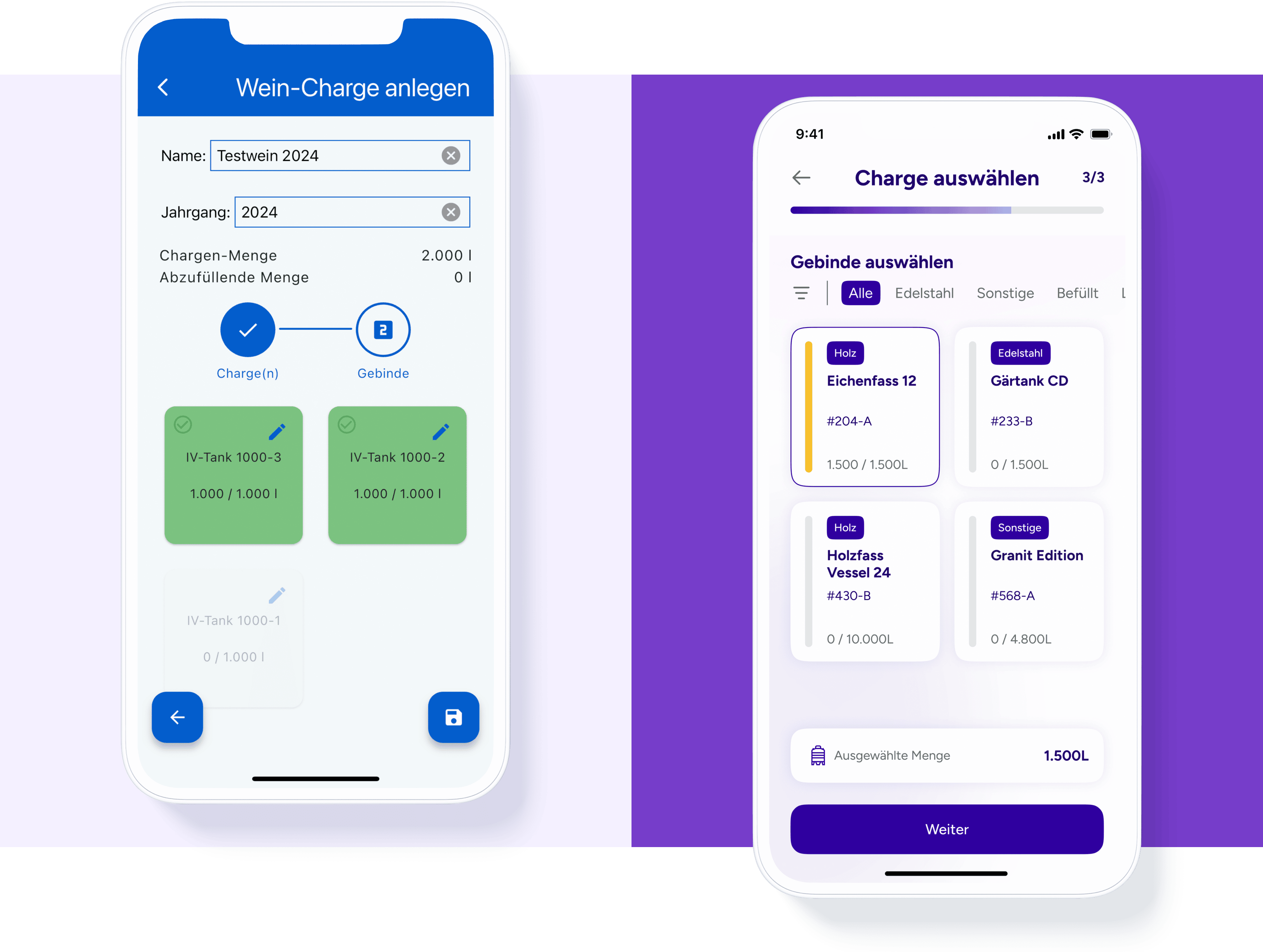
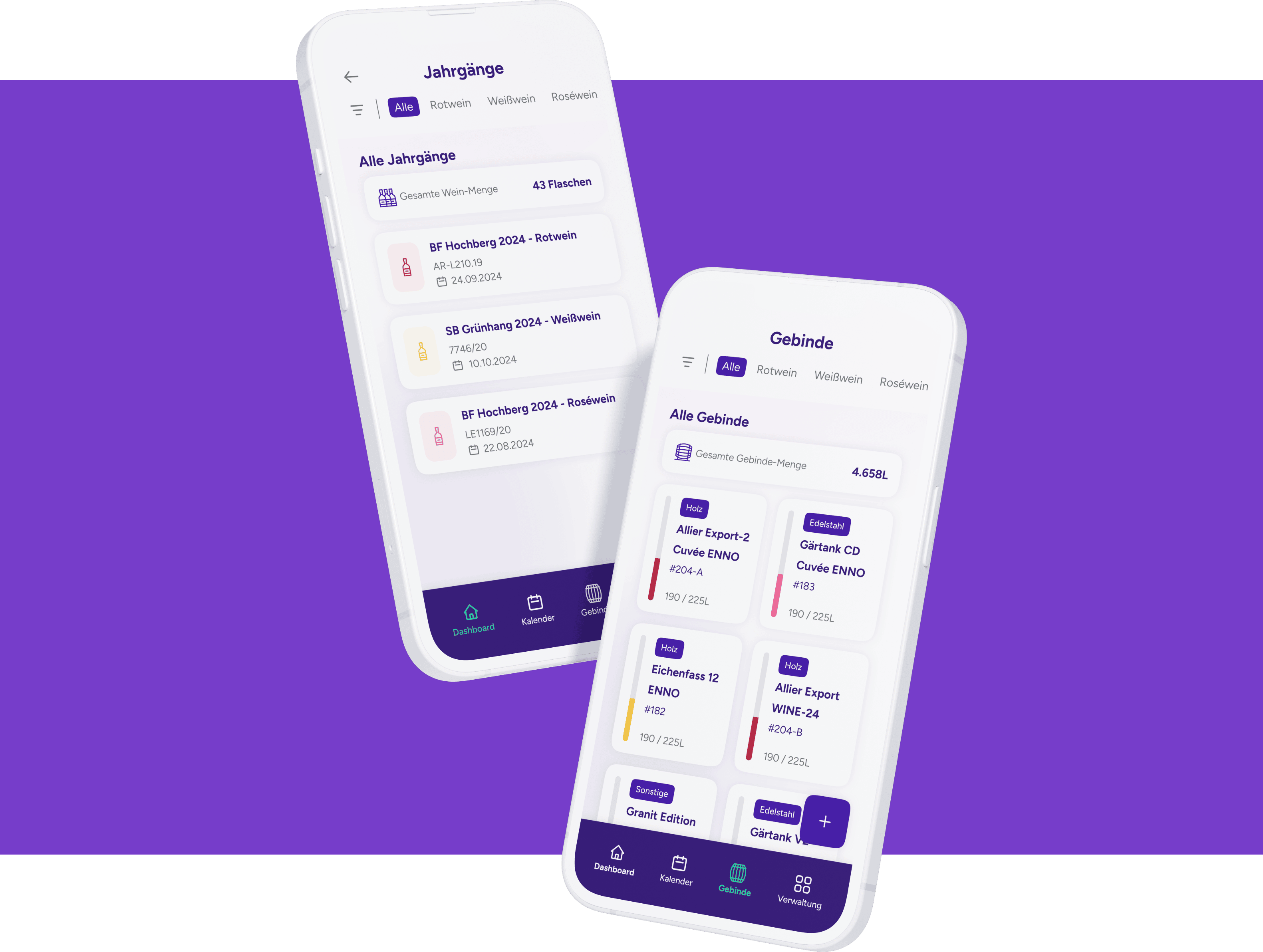
We restructured the app to prioritize key tasks and bring frequently used functions to the forefront, while less critical areas were also simplified. Floating buttons replaced cluttered menus, enabling seamless navigation. The central floating action button in the calendar allows for quick planning of tasks and production phases, guaranteeing that every step is clear, efficient and easy to manage.
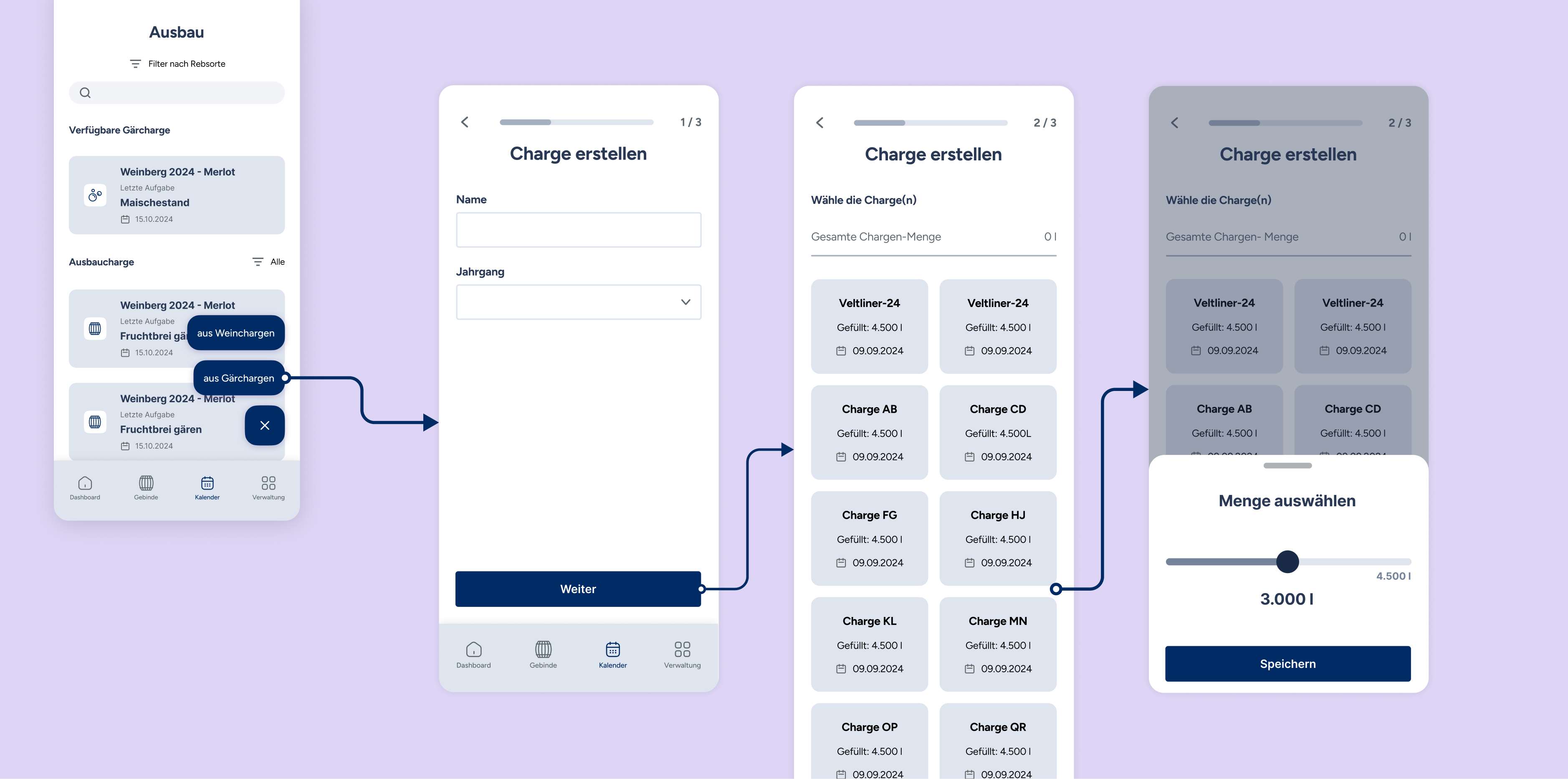
Wireframe flow during the development phase "Ausbau" of production
Creative Process
A unique visual identity that feels just right
Most winemakers are not typical digital natives; they spend most of their time outdoors and, therefore, have a different approach to using digital applications. So, to put them at ease, our goal when redesigning Winealyze was to create a visual identity as refined and unique as winemaking itself.
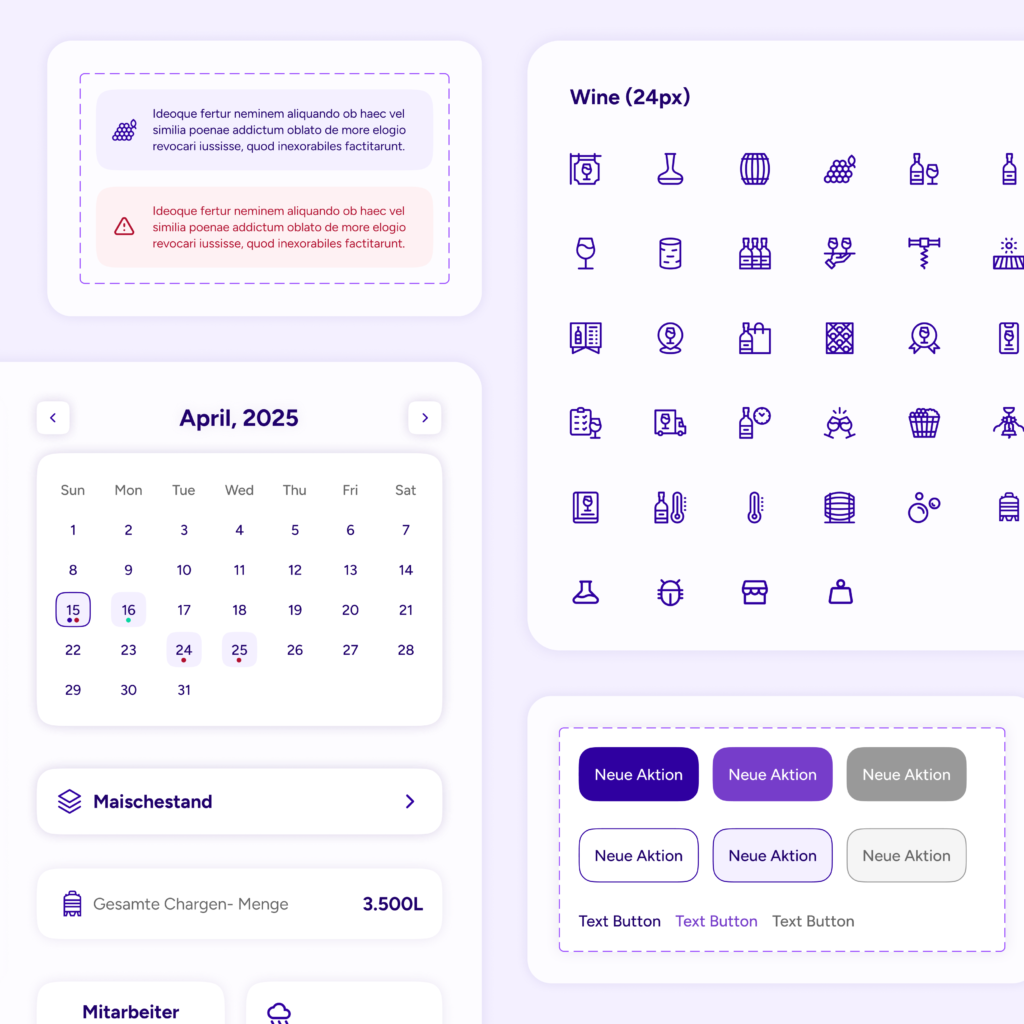
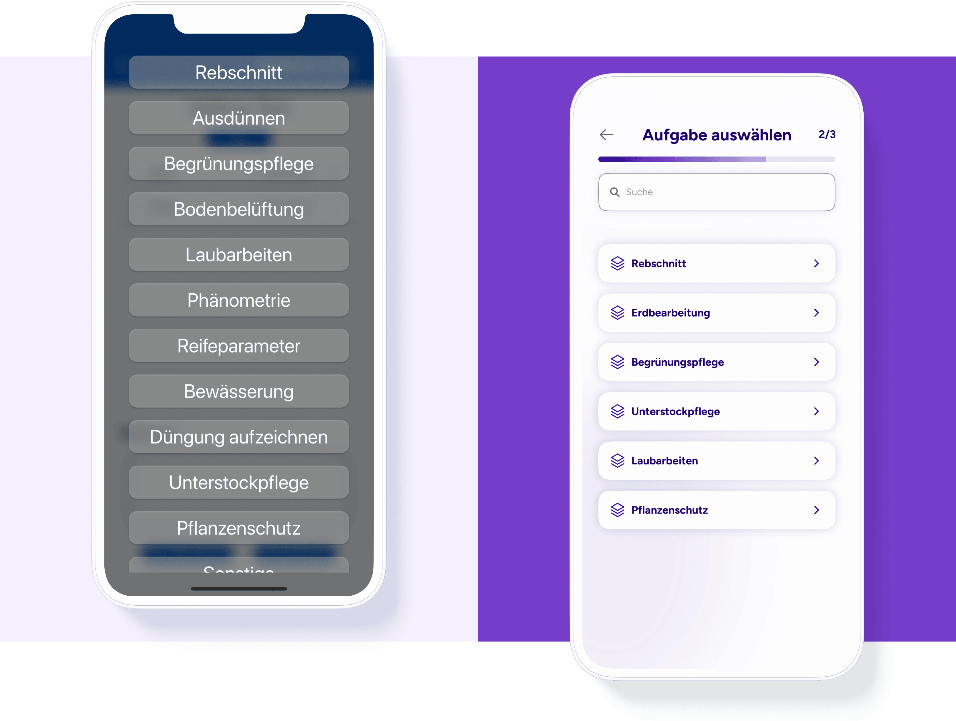
We started by creating a mood board that showcased various color schemes and design styles. After the client selected a direction, we established the foundation of the design system and developed a comprehensive design library to provide both consistency and flexibility. Special attention was paid to integrating icons that reflect the diverse tasks of winemakers: each production phase received its own symbol, as did the different activities within these phases.
Through continuous refinement of wireframes and regular reviews, we ensured that the app was not only visually appealing, but also intuitively usable. The outcome? A design that is both visually captivating and effortlessly functional.
Evolving from Old to Modern Design for Enhanced Usability
Usability Testing
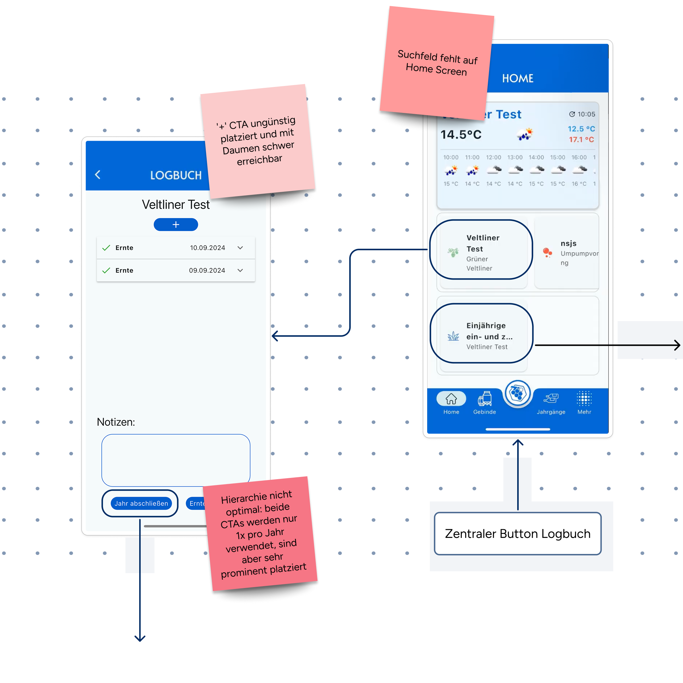
From prototype to real-world usability
Whether in small family-run vineyards or large enterprises, winemaking comes with unique challenges: wet hands, limited time and complex workflows. To make sure that Winealyze functions within the context of these demands, we developed a prototype and tested it in real-world conditions.
We conducted user tests with ten tech-savvy winemakers, businesses of between two to fifteen employees that spanned small family wineries to larger producers. Some were already using digital tools, while others were not. The testing focused on three key user flows and the main navigation.
The valuable feedback we got enabled us to make targeted improvements. As a result, we didn’t just optimize Winealyze, we ensured that it integrates seamlessly into the daily working life of winemakers.
Colors
#1f006b
#763dca
#ffca00
#06d6a0
#f5f5f5
Font
Figtree
A Á B C D E É F G H I Í J K L M N O Ó Ö Ő P Q R S T U Ú Ü Ű V W X Y Z
a á b c d e é f g h i í j k l m n o ó ö ő p q r s t u ú ü ű v w x y z 1 2 3 4 5 6 7 8 9 0
Aa
Light
Aa
Regular
Aa
Bold
The little prince went to see the roses again: "You are not at all like my rose, you are nothing yet", he said to them. No one has tamed you and you have tamed no one. You are like my fox was. It was only a fox like a hundred thousand others. But I have made him my friend, and he is now unique in the world."
“ENNOstudio created beautiful, thoughtfully crafted designs that are both sleek and highly functional. Their attention to detail and structured approach resulted in a polished, visually striking app embedded in a ready-to-use design system.”
Johannes Trimmel
Msc, Co-founder of Winealyze
Learnings
Enhancing Winealyze based on user feedback
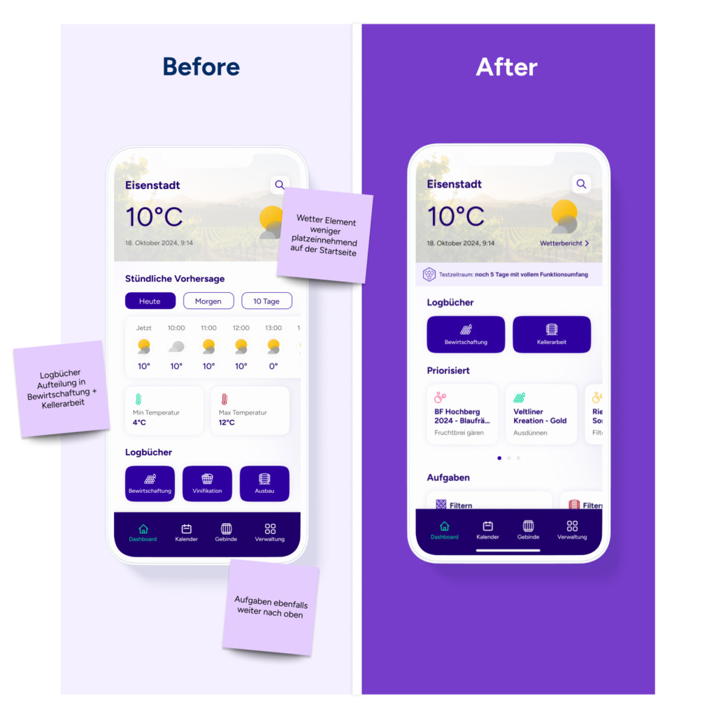
It became clear after the user tests that we needed to tailor Winealyze to the needs of winemakers even more. The feedback highlighted specific areas for improvement: we had to further develop the weather map, integrate the production phases of vinification and maturation under “Cellar Work” on the home screen, and also enable the assigning of tank numbers to different wine varieties. Furthermore, at the client’s request, we replaced the original logo with a custom design that better reflects their identity.
Our goal is always to create solutions that meet user expectations while delivering a consistent experience. We feel we achieved that with Winealyze.
Some of our work
Check out our portfolio.
Some of the memorable experiences that we already created together with our clients.