UNIQA

UNIQA, one of Austria’s premier insurance providers, offers top-tier products covering areas such as travel, healthcare and motor vehicle insurance. We were tasked with refining and optimizing the current travel insurance funnel to enhance usability and drive increased conversion rates.

The Challenge

Streamlining the flow while preserving the product’s architecture

The main challenge in revising the UNIQA reinsurance route was to redesign the route with the existing product architecture and logic in mind. As there was already a well-functioning product, it was important for us to identify further potential in order to develop optimisations based on this, which we would then integrate into the existing UI system.

Client

Uniqa

Services

UX/UI Design, Redesign, Motion Design, UX Audit, Customer Insights, User Research

Date

2023 – 2024

Project link

The Approach

Transforming insights into action: Enhancing the funnel

We initiated an extensive UX/UI audit of the existing travel insurance funnel to gain a comprehensive understanding of its current state. The audit was complemented with qualitative testing involving both UNIQA and non-UNIQA customers. By analyzing insights from the audit, testing and additional analytics, such as drop-off rates, we were able to identify areas for potential improvement in both UX and UI. We leveraged these findings to successfully implement an optimized funnel flow.

Insurance journey audit board
a before and after look of the redesigned insurance wizard
Redesigned wizard framework with clear information hierarchies

Innovative Page Development

Discovering and prioritizing areas of opportunity

Our analysis, based on drop-off rates and user feedback, focused on identifying effective elements and areas that needed improvement, as well as prioritizing optimization opportunities.

Key findings included:
  • UX and UI inconsistencies
  • Dead ends in the wizard where customers need help
  • Ambiguities causing customer confusion and bounce rates


Refinements included:
  • Restructuring the user flow to reduce clicks and streamline the process for better comprehension and experience.
  • Introducing consistent information hierarchies to improve understanding.
  • Guiding customers at previous dead ends to prevent drop-offs.

Product Selection

Customizable products with a dynamic overview of insurance coverage

Our work focussed in particular on the area of product selection itself, as this is the core area of the entire insurance route. In contrast to previous variants, we developed a dynamic input, which makes it possible to display, depending on individual choice, the insurance benefits a customer will and can receive. In this way, we increase the understanding of those benefits included in the package selected by the customer and those that can be added to it, and also highlight missing benefits.

detail view of product cards
a before and after look of the redesigned insurance overview
Redesigned product recommendation
the redesigned progressbar of the travel insurance
Two states of the redesigned progress bar

Navigation

An informative progress bar guides you through the funnel

The previous funnel version of the insurance journey was lengthy; causing customers to quickly lose track of where they were in the process and what selections they had already made. This issue has been addressed with the newly introduced progress bar. This feature allows customers to easily track their progress at any point in the process, see which inputs they have already made, and let’s them know how many steps remain until the product purchase is finalized.

mobile clay mock up of travel insurance screen

Motion Design

Transitioning from static to dynamic via motion design

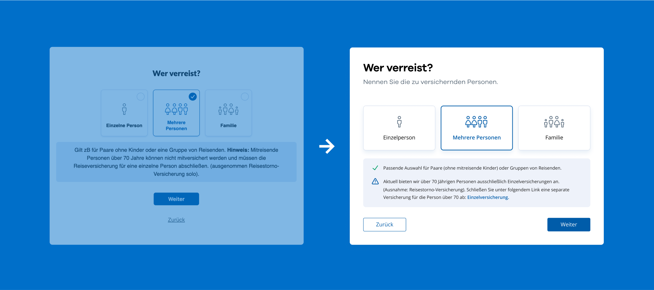
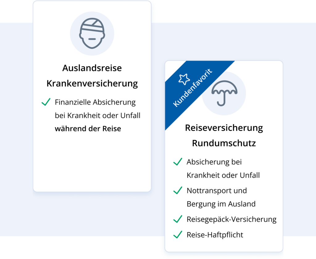
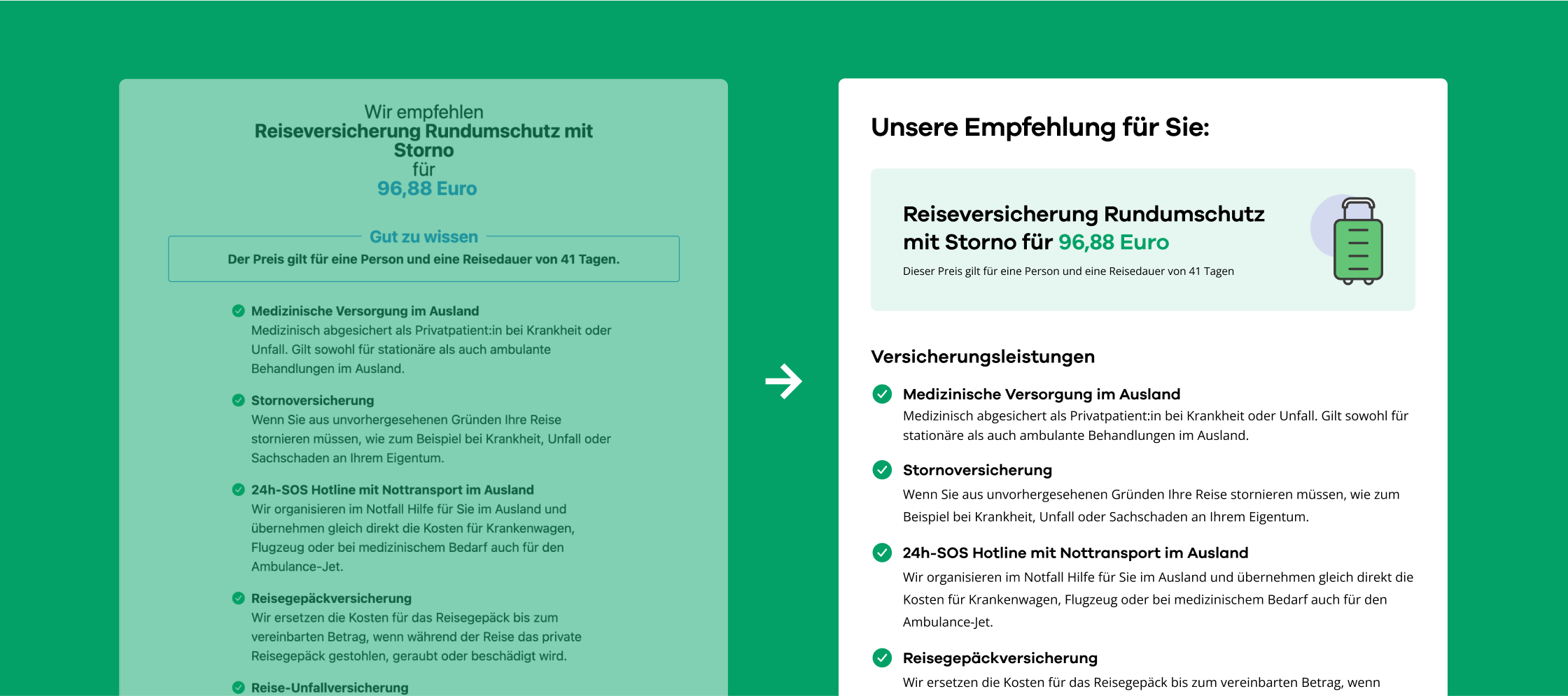
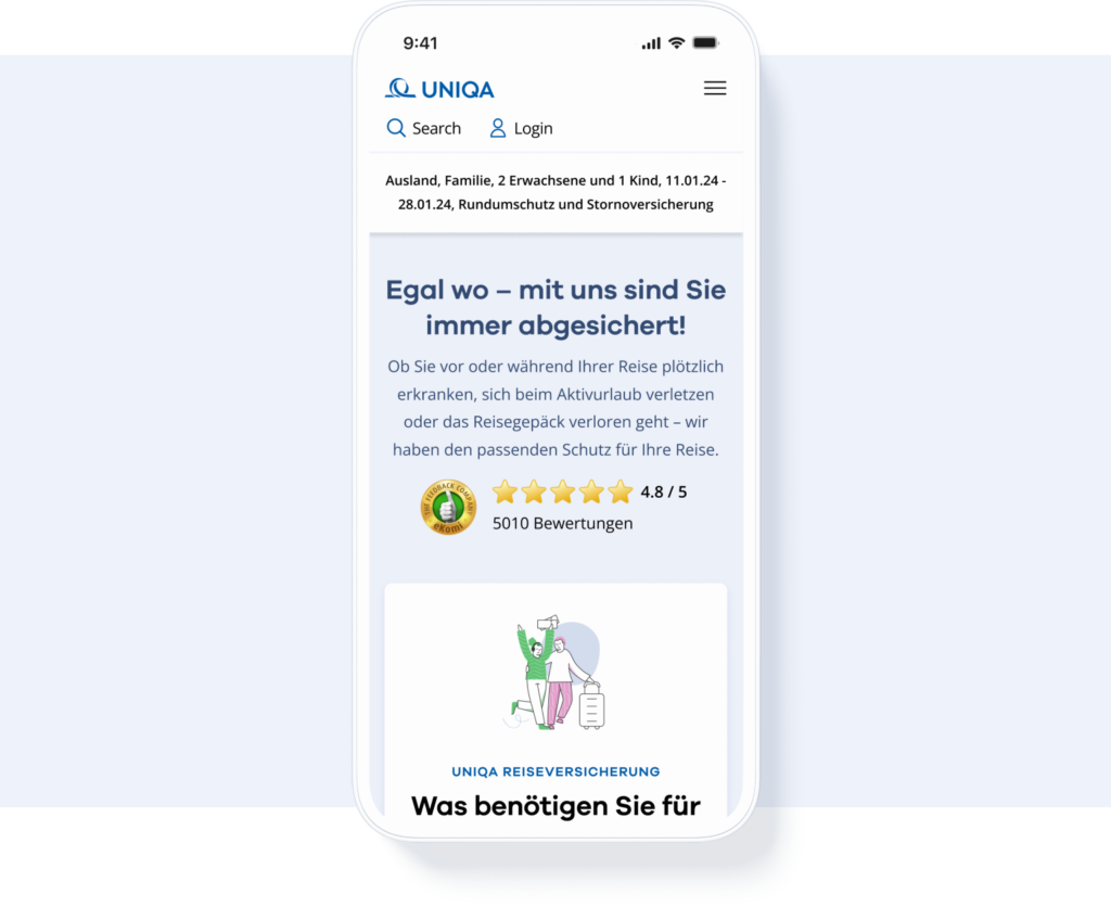
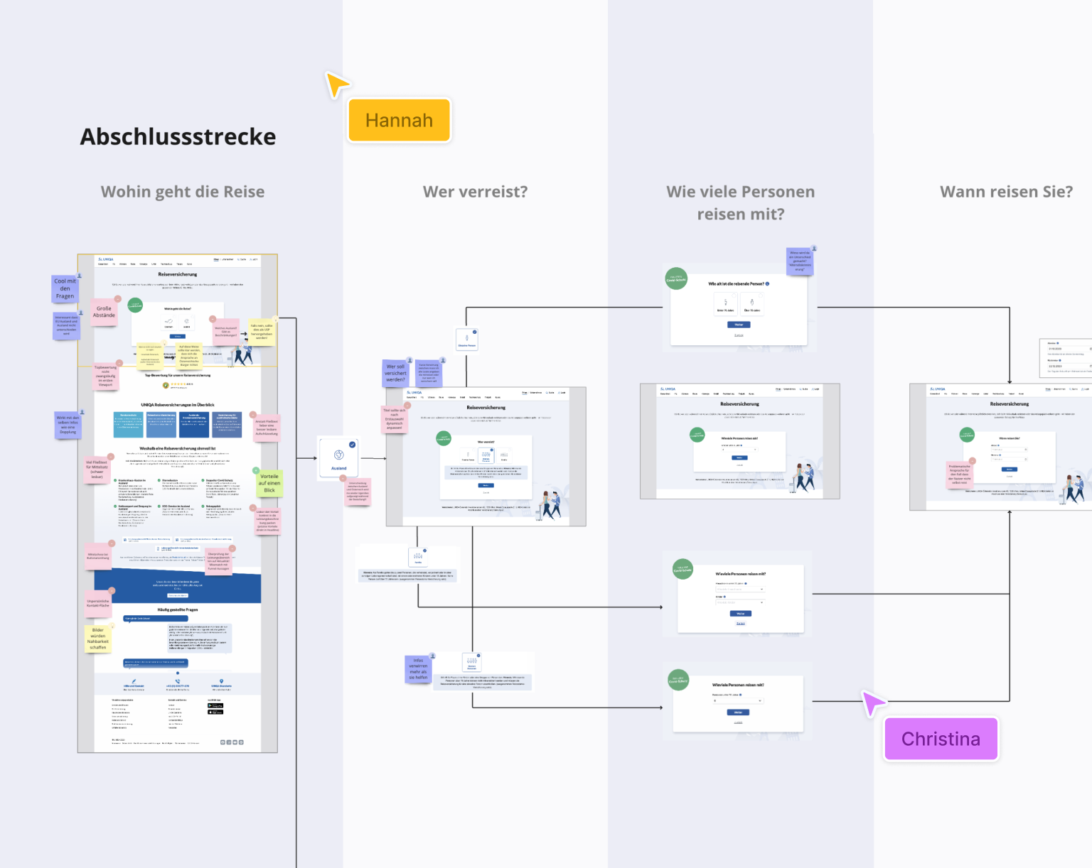
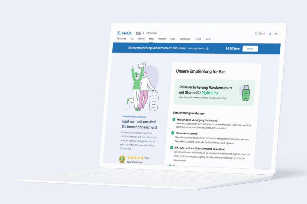
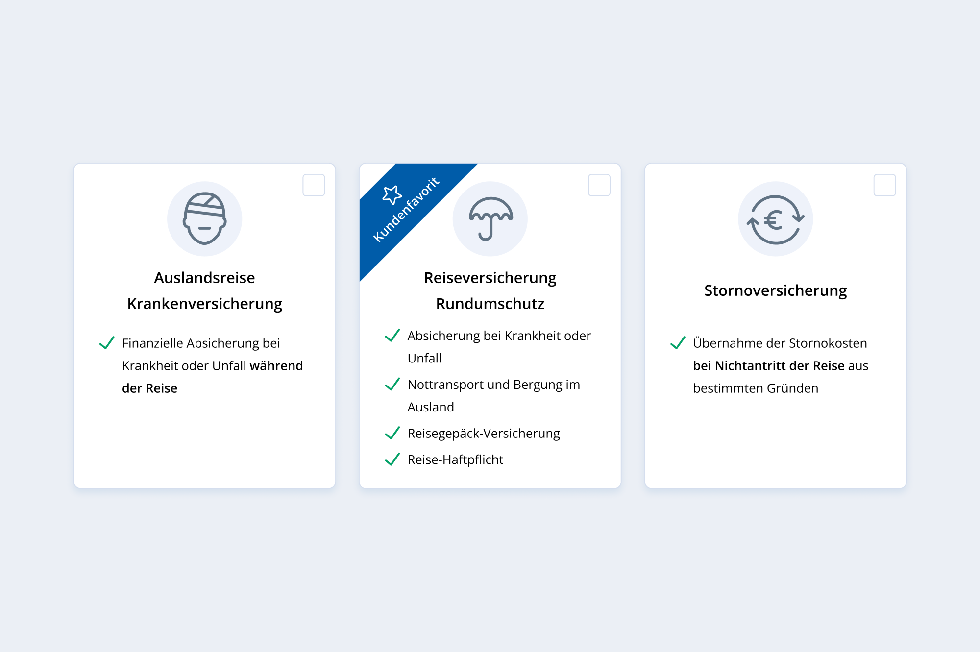
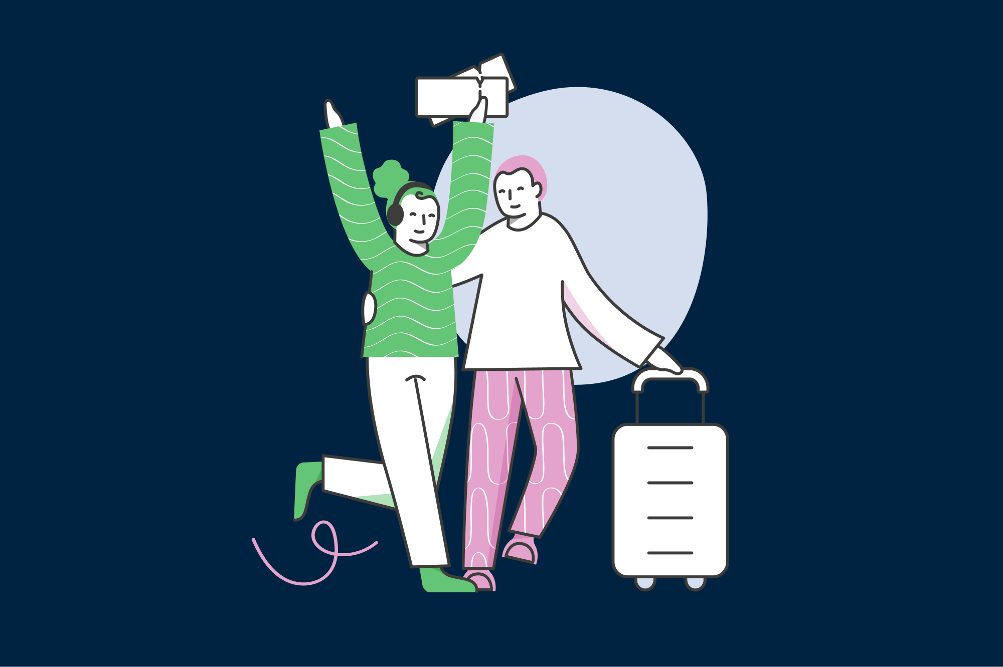
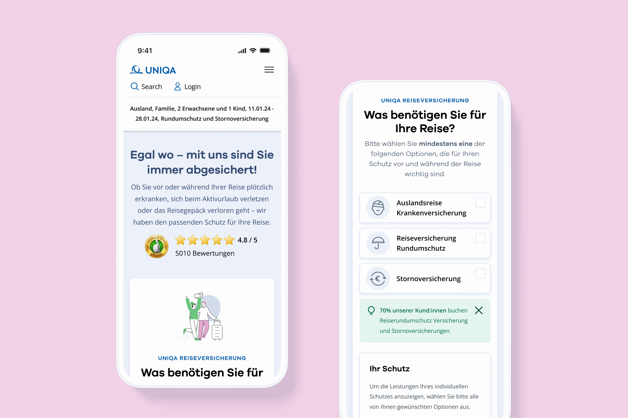
During the visual redesign of the travel insurance journey we introduced animated illustrations to deliberately break the monotony of the wizard. At the same time, we ensured that these animations keep the customer’s focus on completing the product purchase. The subtle, cheerful animations create an inviting feeling, revitalizing the seemingly dry nature of insurance and enhancing engagement with it.

Colors

#005ca9

#006fc9

#ccdeee

#03a167

#002342

Font

Galano

A Á B C D E É F G H I Í J K L M N O Ó Ö Ő P Q R S T U Ú Ü Ű V W X Y Z

a á b c d e é f g h i í j k l m n o ó ö ő p q r s t u ú ü ű v w x y z 1 2 3 4 5 6 7 8 9 0

Aa

Light

Aa

Regular

Aa

Bold

The little prince went to see the roses again: "You are not at all like my rose, you are nothing yet", he said to them. No one has tamed you and you have tamed no one. You are like my fox was. It was only a fox like a hundred thousand others. But I have made him my friend, and he is now unique in the world."

“After in-depth analysis, ENNOstudio delivered great new designs that optimized the client's online sales journey. The team delivered high-quality items on time and communicated efficiently through virtual meetings. They were talented, friendly, experienced, and impressively qualified.”

Josef Niederwimmer

Product Owner Online Sales – UNIQA Österreich

Learnings

The Value of External Insights in Product Optimization

Every design and product line always has potential for optimization. Often, in-house product teams work on specific issues for months or even years. When working internally on something, it can sometimes be beneficial to bring in an external team to provide an outside perspective. Even with a small number of users, many opportunities for improvement can be quickly identified. It is a misconception to think that large budgets and vast numbers of users are always necessary to identify most of the optimization potentials.

clay laptop mock up of travel insurance recommendation page

Some of our work

Check out our portfolio.

Some of the memorable experiences that we already created together with our clients.

Coming Soon!

We can’t disclose any information regarding this project for now. If you want to be sure not to miss it when we publish it, drop us an email