
Design Audit
The compass that leads us to a successful onboarding flow
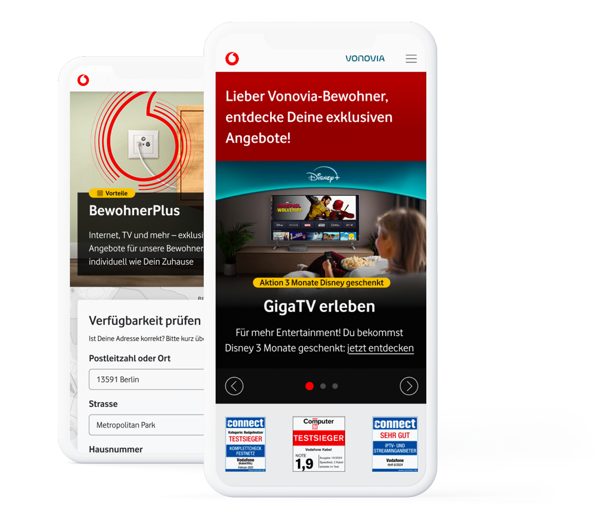
While auditing we focused on the journey’s logical flow to ensure the path feels intuitive and that the content is clustered correctly and harmoniously. We also check that users know what to expect next so they can navigate with confidence, especially when being guided to 3rd party services.
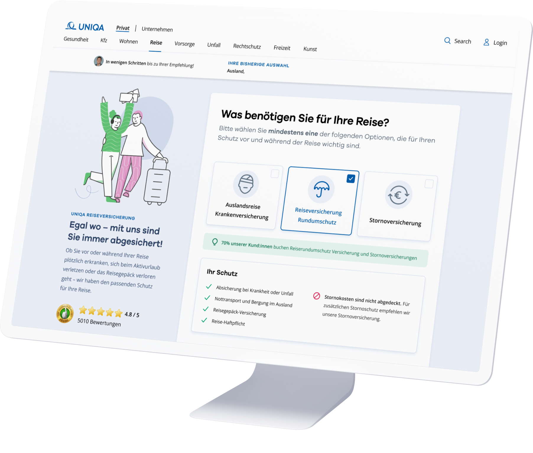
Special focus is placed on UI elements that are needed when guiding users like CTA, forms and input fields, as well as visual supports like illustrations and icons. Our goal is to align every interaction with the well-established UX patterns that users have come to expect, while also ensuring they have a comfortable experience at the same time, particularly with regard to accessibility and usability standards.
Last but not least, we check content and messaging to make sure the language is clear, comprehensive and to the point while also meeting user needs.
Creative Process
Eliminating pain points and optimizing wireflow
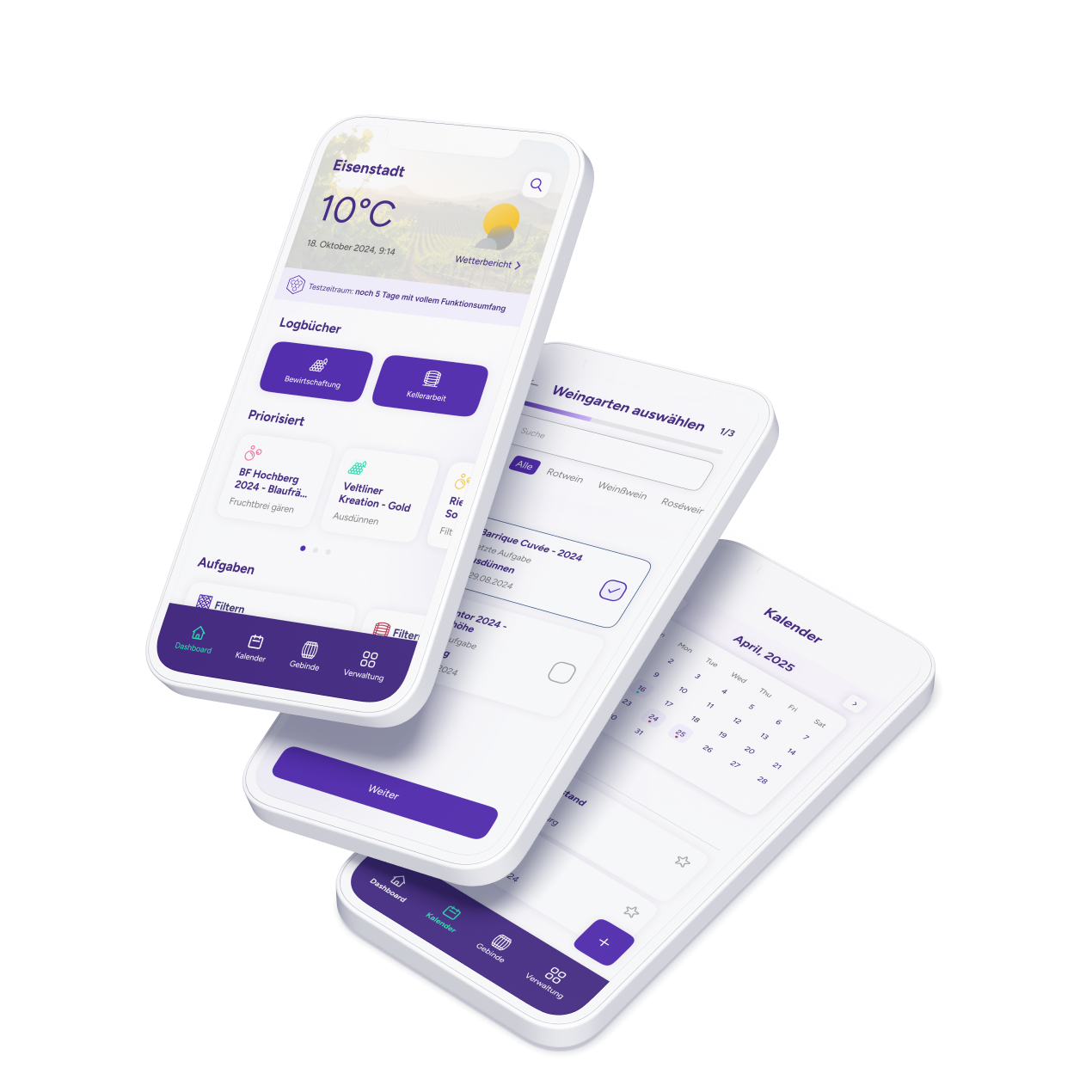
Our focus – using findings from our audit and the user tests – was on optimizing the Customer Journey and eliminating pain points. Utilizing Figma, we designed wireframes and a wireflow, so as to visualize the optimal user experience. In this process, among other things, we streamlined waiting screens and redefined question pairings for greater intuitiveness. We also focused on customer-centric text adaptations to make the flow easier to understand and more engaging.


Product Strategy
Enhancing user experience and interface
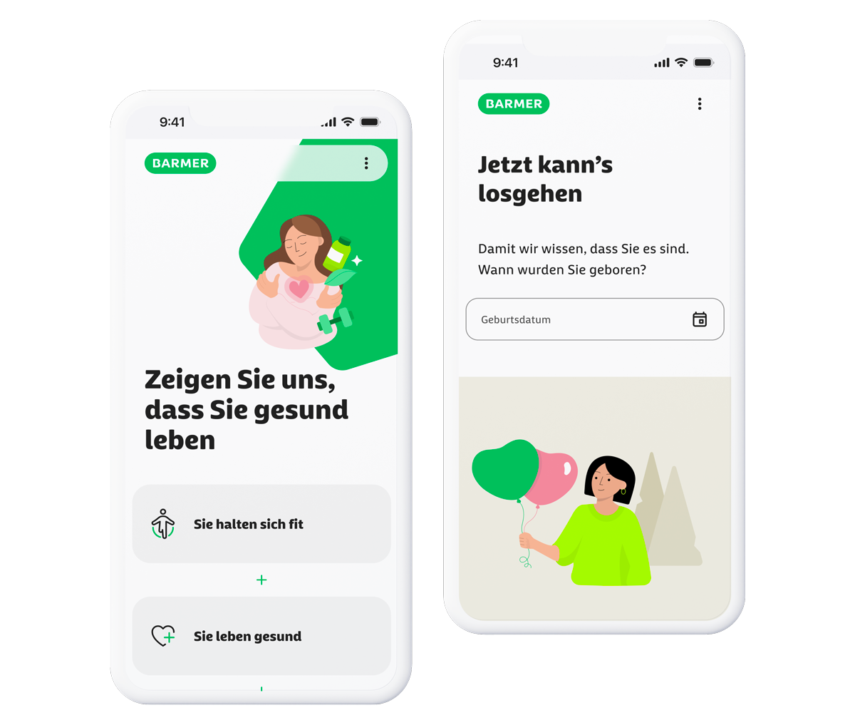
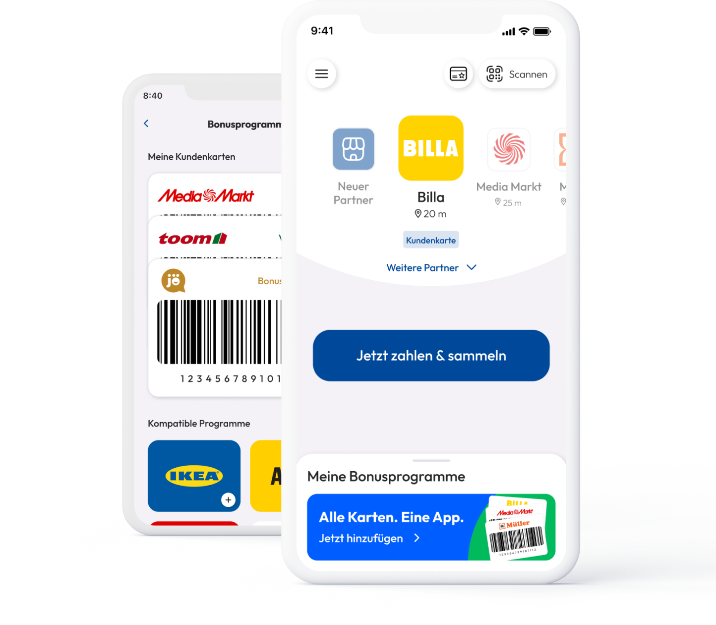
With the optimized wireflow as a foundation, we focused on concrete improvements to the UX and UI. We changed the progress bar for better guidance and included interactive tool tips and step-by-step explanations for user support. We also introduced eye-catching illustrations and icons for added visual appeal. In addition, our team refreshed the interface design and implemented branding elements specifically tailored to retail partners and seamlessly fitting into the white label solution.


