Vodafone BewohnerPlus

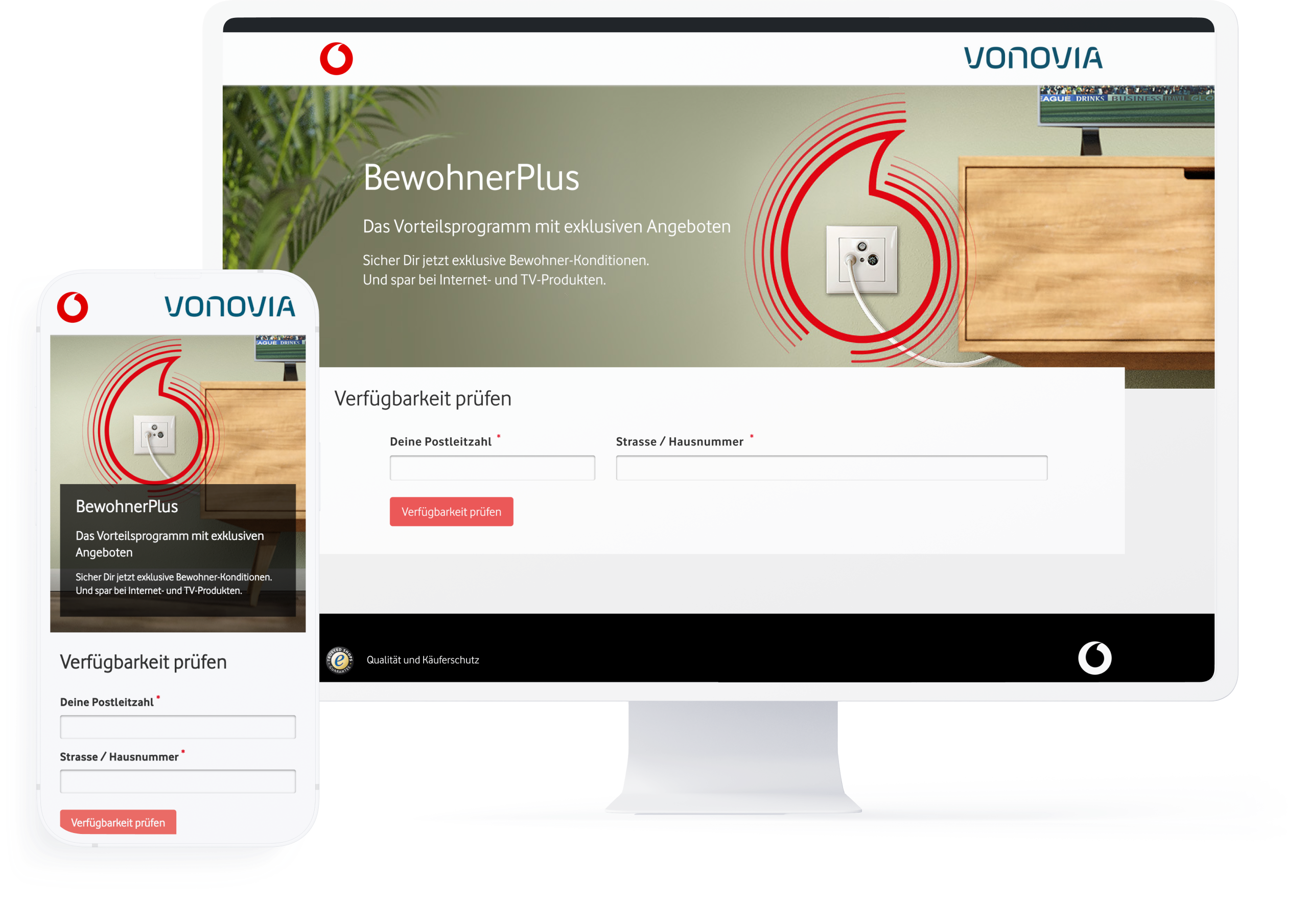
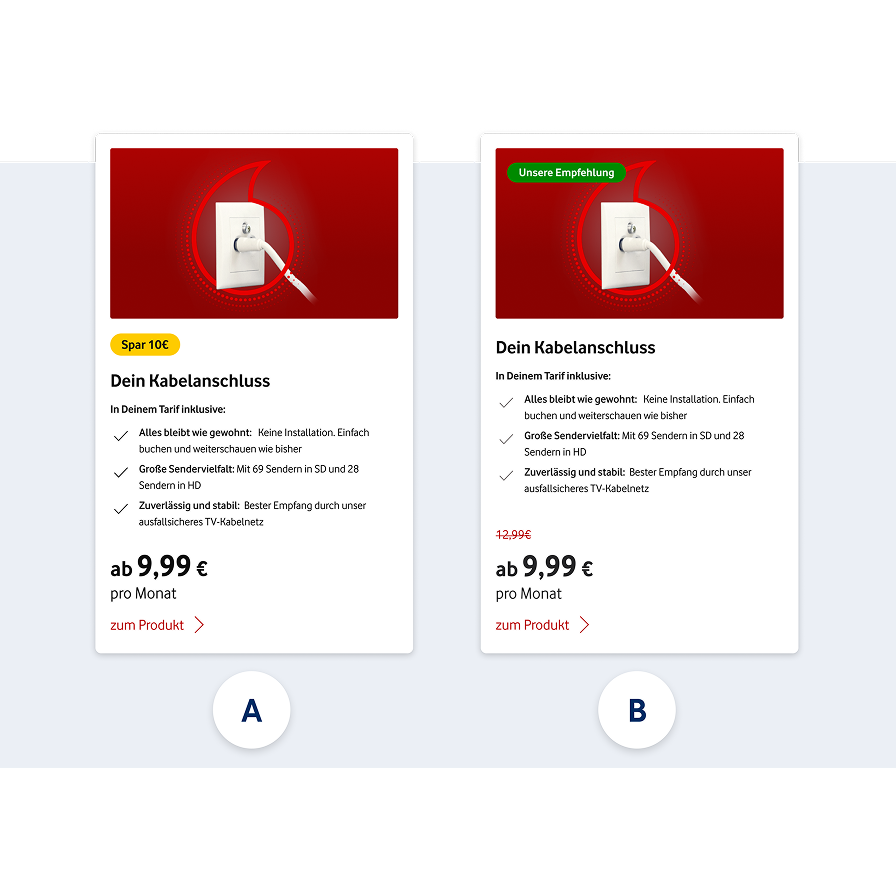
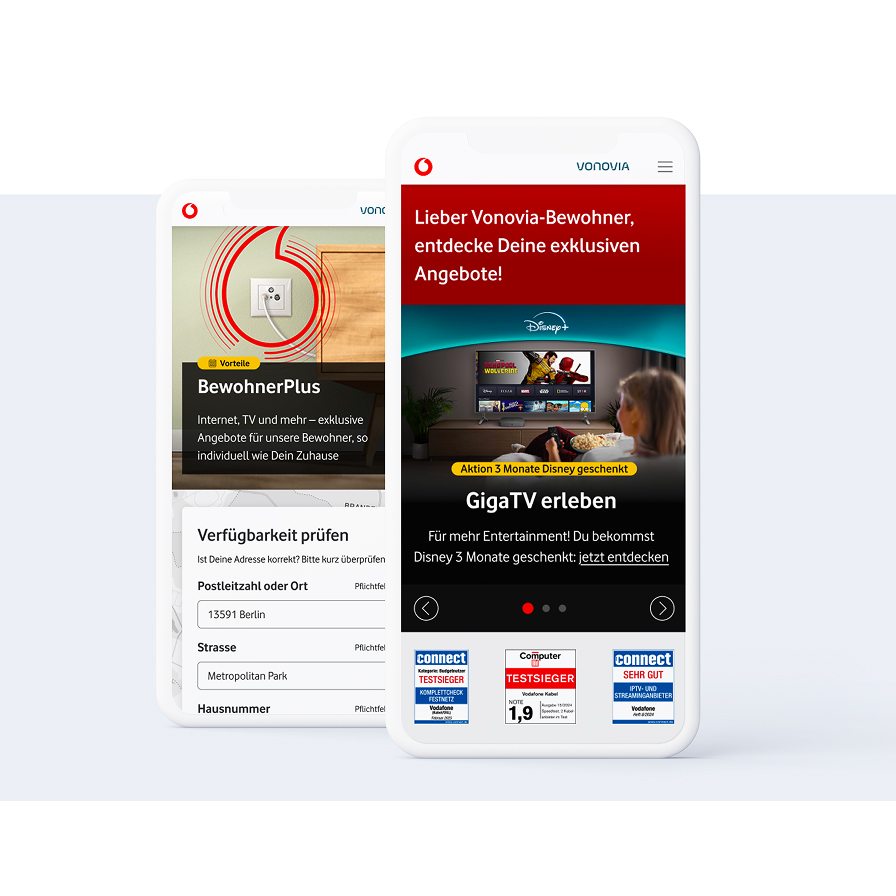
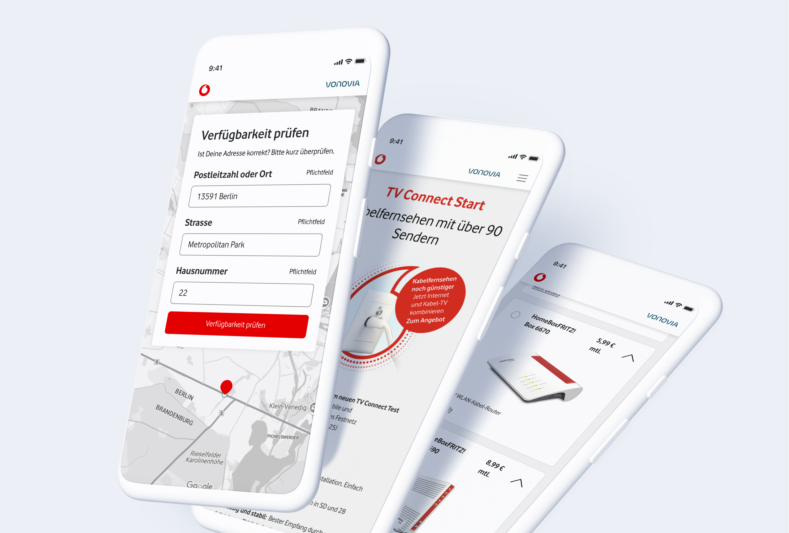
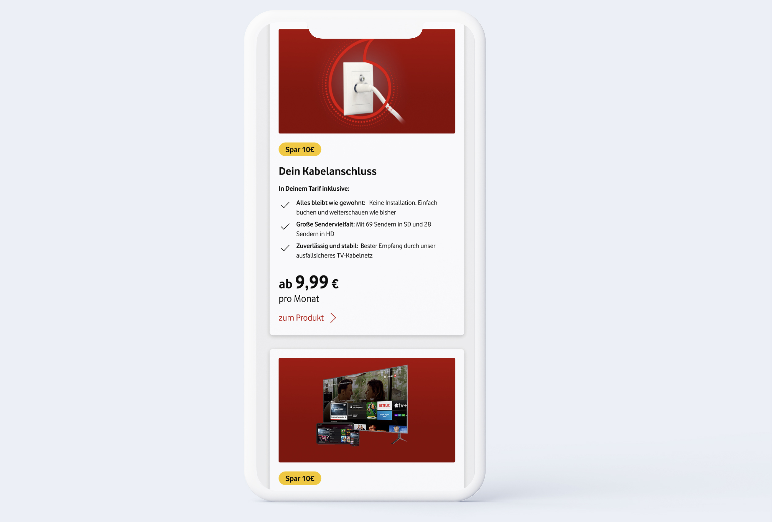
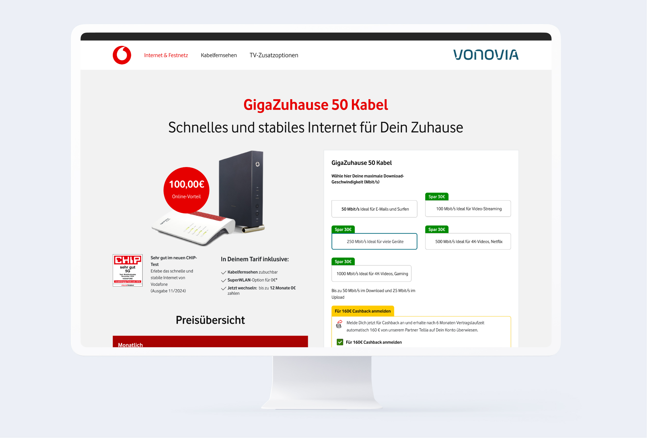
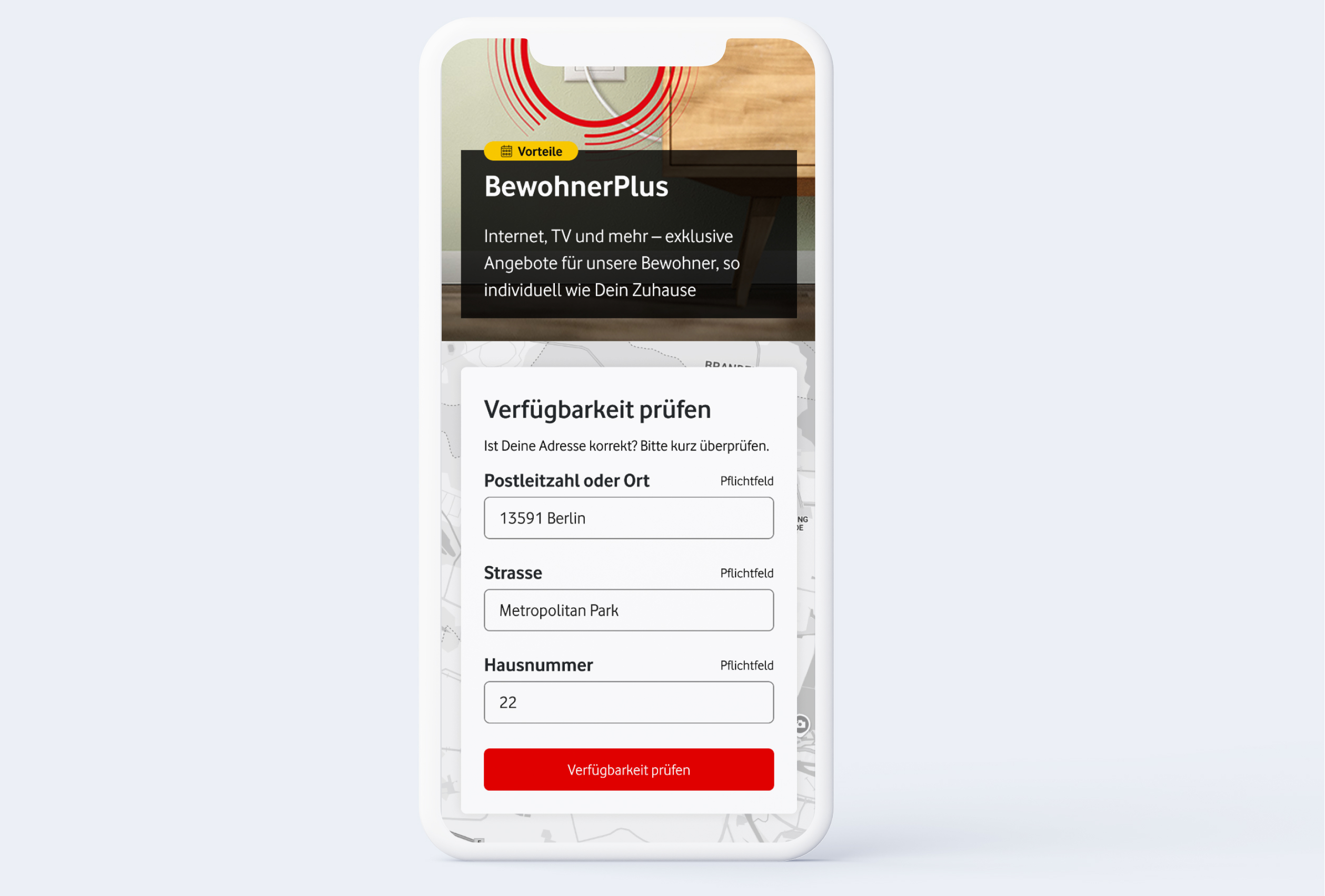
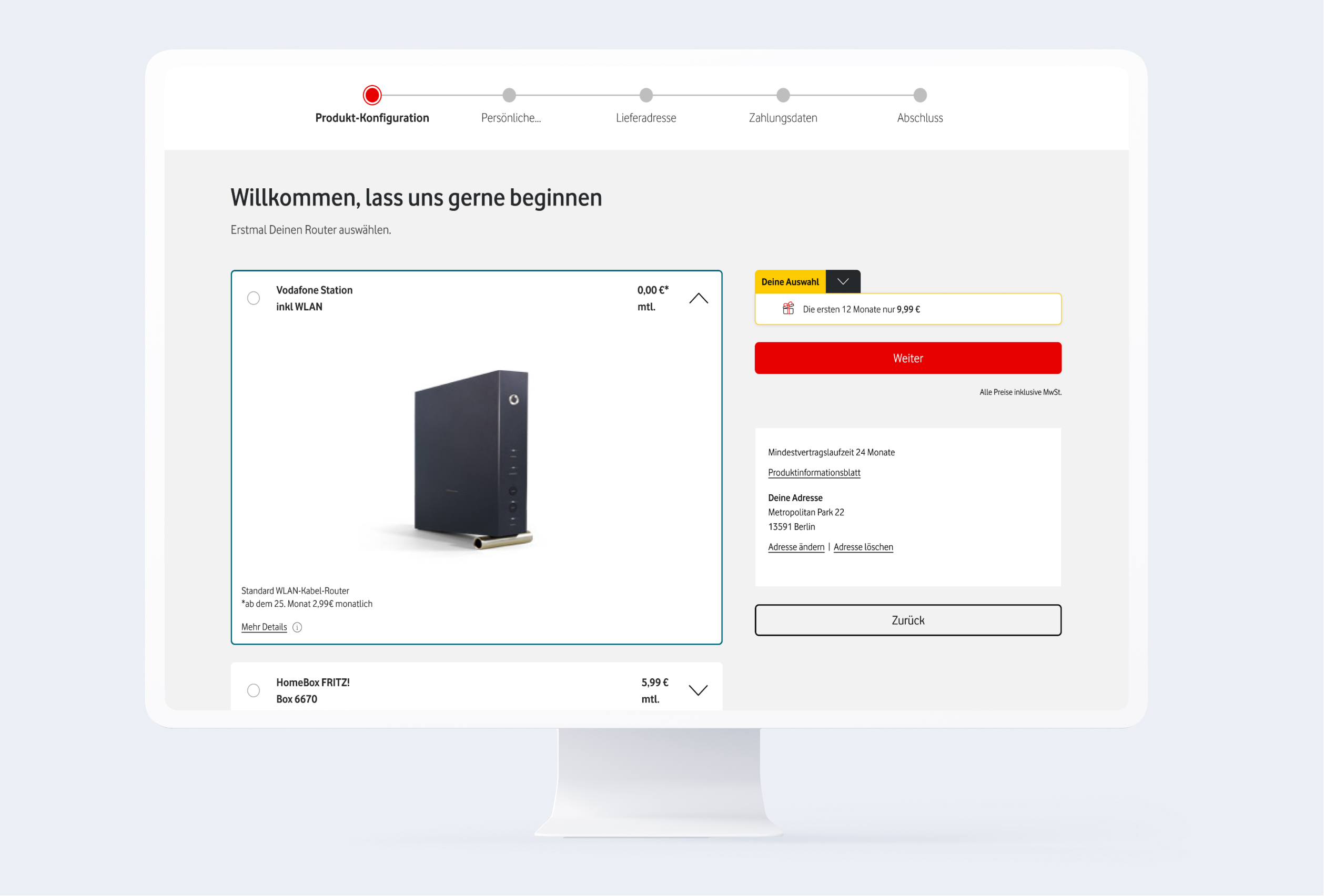
Vodafone BewohnerPlus is an exclusive benefit program for tenants in buildings already connected to the Vodafone cable network. Via Vodafone BewohnerPlus, eligible customers can secure permanent discounts or one-time credits on internet, TV, and mobile plans. The program specifically targets residents in properties managed under existing access agreements with landlords or property managers.

The Challenge

Modernization & trust: Vodafone shop relaunch with a focus on accessibility

How do you transform an existing shop into a modern experience? We realigned the multimedia online store with a clear focus on user guidance (UX) and curated highlight products. The result is an optimized customer journey that not only boosts conversion but also guarantees maximum accessibility for all target groups through full BFSG compliance.

Client

Vodafone

Services

UX Audit, UX Research, UX/UI Design, Prototyping

Understand

Status quo analysis & UX audit: The foundation of optimization

An exact understanding of customer needs formed the basis of our initial phase. This was the only way to sustainably improve user experience, boost conversion rates, and effectively strengthen joint marketing efforts.

To achieve this, we sharpened target group profiles via updated personas and conducted a deep-dive needs analysis. These actions relied on external market research and data-driven evaluation of internal sources like website analytics. By benchmarking the status quo against current best practices we identified clear potential for optimization, specifically regarding entry points, user flow and accessibility.

Plan

Scenario-based wireframes & user flows

We translated the analytical insights from Phase 1 directly into scenario-based wireframes. Our goal was to design a user journey that specifically centers on customer need.

In order to meet Vodafone BewohnerPlus’s sales objectives, we split the user guidance into two strategic streams:

  • Differentiated Use Cases – We developed a multi-product flow that intuitively handles the complex selection and bundling of multiple products.
    Simultaneously, we designed an efficient single checkout for users focused on a specific individual product.
  • Target Group Specific UX – This architectural separation ensures that the design remains scalable. It precisely targets every user type – from quick deciders to those needing guidance. At the same it still keeps usability clear; even for complex carts (avoiding cognitive overload).

Design

UI design & guidance: Transparency via guided processes


In the final UI design, we transformed concepts into high-fidelity prototypes for mobile and desktop applications. We followed Vodafone’s Corporate Identity (CI) strictly to ensure seamless and trustworthy brand consistency across all touchpoints.

  • Structuring via Wizard: To simplify navigation we implemented a step-by-step wizard. This approach breaks down complex selection processes into small, understandable units (reduction of cognitive load). It guides users safely through the funnel and measurably lowers drop-off rates.
  • Guidance & Transparency: We optimized the information architecture using contextual help elements like tooltips, infoboxes, and accordions. These functions deliver explanations exactly “on-demand” at the point where questions might arise. The result is maximum price transparency; eliminating uncertainties and strengthening user trust throughout the entire customer journey.

Optimize

Usability testing & BFSG compliance: Validated data over hypotheses

Design hypotheses are good; validated data is better. To eliminate subjective assumptions, we put our concepts to the test. Our testing approach pursued a dual aim: validate the user experience (UX) and simultaneously ensure BFSG accessibility.

  • A/B Testing & UX Validation: We tested alternative variants for critical interaction points, which secured compliance and identified the solution offering the best experience based on data.
  • Data-Driven Flow Optimization: Test feedback flowed directly into development. We implemented validated-only changes to guarantee a final process based on real user feedback, which effectively eliminated friction at the checkout.

Colors

#e60000

#ffffff

#4a4d4e

#25282b

#0096ad

Font

Vodafone Rg

A Á B C D E É F G H I Í J K L M N O Ó Ö Ő P Q R S T U Ú Ü Ű V W X Y Z

a á b c d e é f g h i í j k l m n o ó ö ő p q r s t u ú ü ű v w x y z 1 2 3 4 5 6 7 8 9 0

Aa

Light

Aa

Regular

Aa

Bold

The little prince went to see the roses again: "You are not at all like my rose, you are nothing yet", he said to them. No one has tamed you and you have tamed no one. You are like my fox was. It was only a fox like a hundred thousand others. But I have made him my friend, and he is now unique in the world."

“We are extremely satisfied with the UX project executed by ENNOstudio. From the start, our collaboration was smooth and built on trust, with our requirements and user needs always prioritized. Their team reacted quickly to questions or adjustments, which ensured that the project moved forward efficiently. We felt in good hands at all times and the final result was truly convincing for us.”

Thorsten Seibold

Senior Manager Online Sales

Result

Sustainable optimization & outcome

This project proves that betting on real user data was a winning strategy. By combining clear processes (Wizard) and accessibility (BFSG) we radically simplified complex requirements.

The result is a future-proof shop that safely guides its users. This transparency not only builds trust but boosts sales performance in a sustainable manner.

Some of our work

Check out our portfolio.

Some of the memorable experiences that we already created together with our clients.

Coming Soon!

We can’t disclose any information regarding this project for now. If you want to be sure not to miss it when we publish it, drop us an email